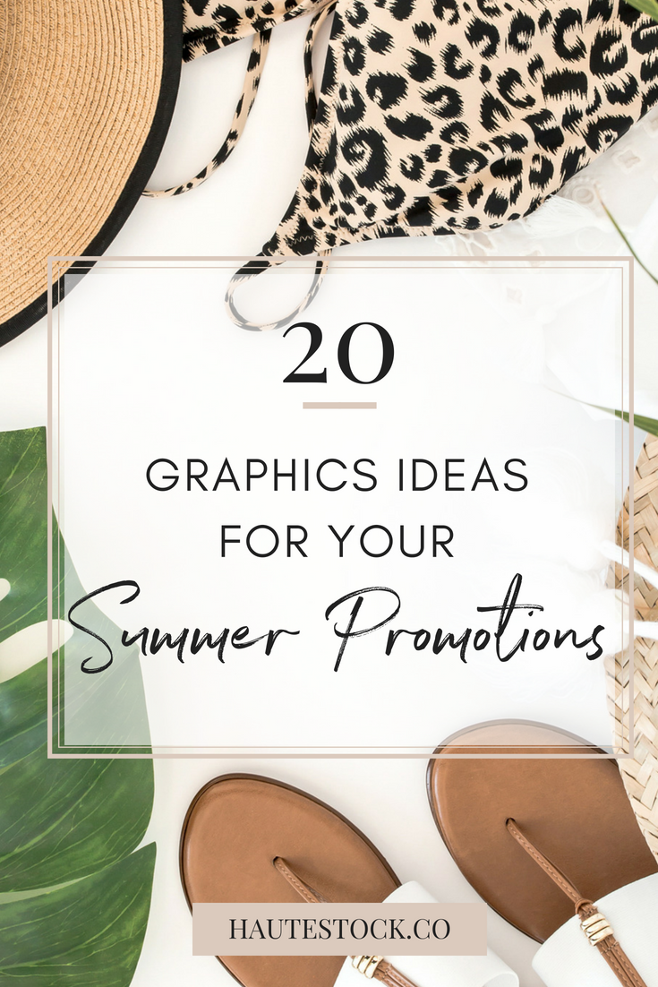
20 Graphics Ideas for your Summer Promotions
It's hard to believe that another summer is upon us! For many online businesses this can be a slower time of year as people are spending less time in front of a screen and more time outside.
If you're feeling your revenue dip as the temperatures soar, you can boost sales during the summer months through promotions and special offers.
In today's post we've got some examples of summertime promotion graphics that you can create to get people excited for your offers.
All of these examples were created using images from our Sand, Tropical Vibes, and Picnic collections, available exclusively to Haute Stock Library Members.
We used a variety of images from our different summer collections to show just how versatile these photos are.
Whether your brand is bright and full of pops of color or more on the muted side, you can make virtually any images work by adding on-brand text, color blocks, and icons.
Though these photos are quite different from each other, we kept the visuals cohesive by using pink, tan, white, and black for the text, color overlays, and other elements.
So if you're all about exploring the city, relaxing at the beach, sitting under the palms, or enjoying a day at the park (or all of these things!), you can pick and choose your favorite stock photos to create cohesive and visually appealing summer related graphics.
These images are great for everything from blog posts, to header images, to ads and more.
Even if your promotion has nothing to do with summer, it is the season after all and you can easily grab people's attention with these fun images.
Alright, so let's get into the examples!
Facebook Posts
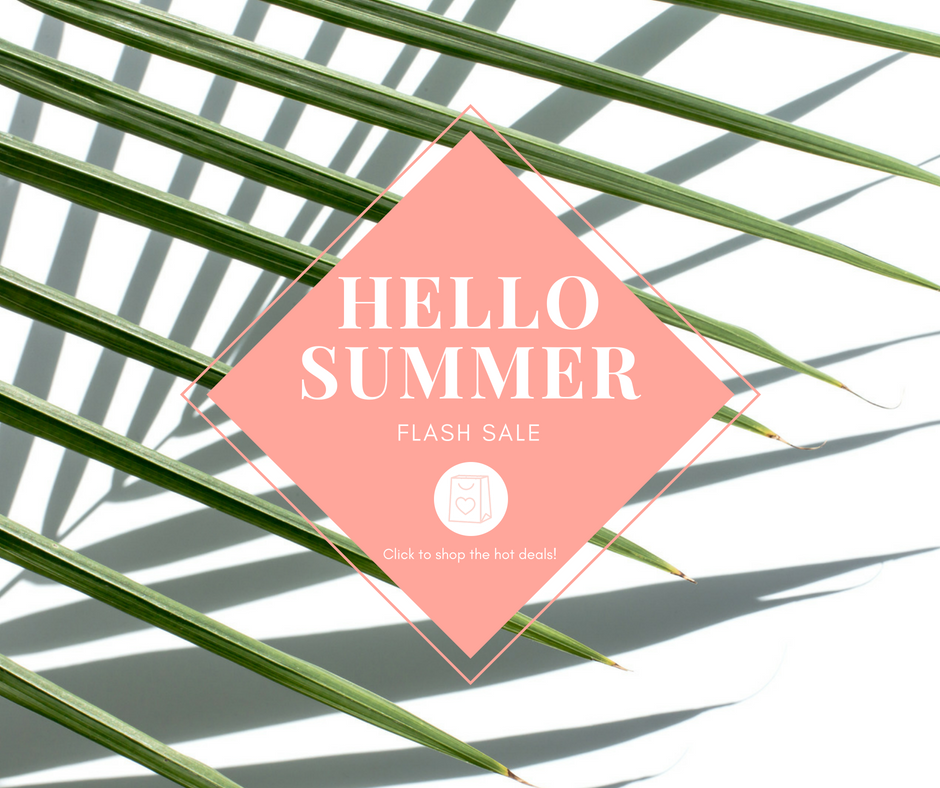
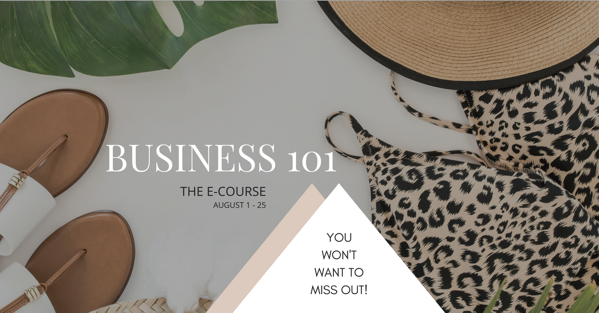
Who could resist checking these out when scrolling through their newsfeed? The copy on the images doesn't have to be extensive. Just get people to stop scrolling long enough to read your post and click on your link!
Design Tip: If you're using images without negative space, like the one above, add a colored overlay under your text to make it pop. We've also added a shopping bag icon from one of our graphics packs to tie in the theme of a summer sale and add visual interest to the graphic.
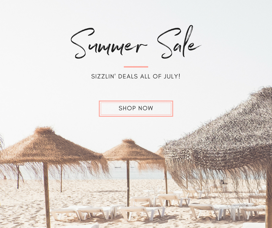
Design Tip: For images with negative or white space, you can really do anything! Just make sure to keep it simple, use easy to read fonts, and use only one call-to-action.
Facebook Ads
If you're willing to spend some cash to get traffic, Facebook Ads are the way to go. Don't forget about the 20% Text Rule!
Design Tip: Images like the one above with a colored overlay or colored background are great for ads because they disrupt the rest of the newsfeed. Give it a try and see if they convert higher than images with lighter backgrounds!
Design Tip: Don't forget to select images that will be attractive to your target market. That's the only way to get them to take interest and pay attention!
Headers or Hero Images
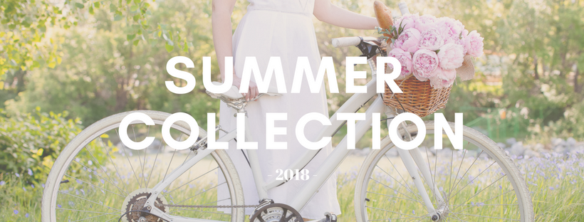
These graphics are BIG, BOLD and are prime real estate for your promotional images. Chances are, they're the first image people will see when they land on your page.
Use these types of header images for Website Headers, Facebook Page Covers, and Newsletter Headers.
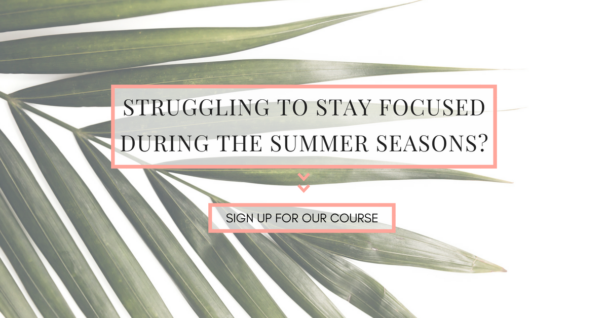
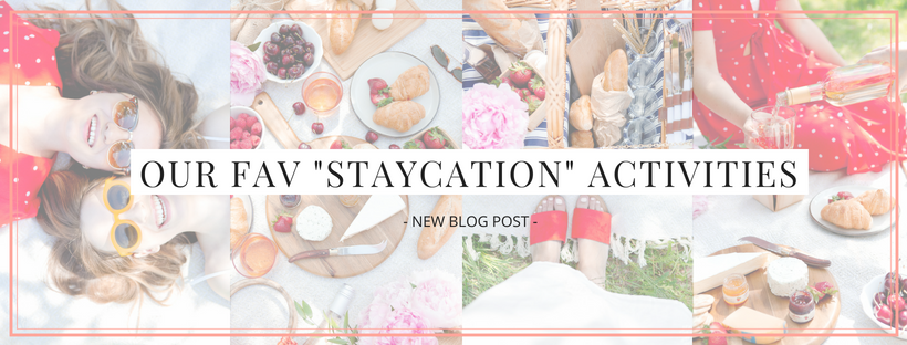
Design Tip: If you're going to put text over a photo without white space and you don't want to use an overlay, simply decrease the opacity (or transparency) of the photo. That will allow your text to stand out more — that's what we've done with each of these images from the Picnic collection.
Design Tip: You can combine two or more photos to create the perfect graphic. That's what we've done in the image above — we used the same palm image on either side. It fills in the graphic, completes the look, and frames the text, so the attention is centered on the offering.
Social Media Graphics
Social media plays an important role in any type of promotion we do. These square images can be used on either Instagram or Facebook.
Design Tip: These images should be fun and eye catching, which is pretty easy to accomplish using photos from our summer collections. Keep your text to a minimum and entice readers with getting all the deets by clicking through to your website. You could also use these graphics in your blog posts or as sidebar images. Choose images with different focal points (i.e. overhead, side-view, close-up) and add elements like text blocks and colored overlays for emphasis and to create interest.
Sidebar Buttons
Your blog sidebar (if you have one) is a great place to place promotional graphics. You can also use these types of vertical orientation graphics for blog posts, and inside your newsletters.
Design Tip: Our recommendation is to make them large (say blog post size) and then scale them down to use for buttons and other areas where you don't need a huge image. Remember, it's always better to create a larger canvas and scale it down. If you make them small and then try to use them for something which requires larger images, they will look blurry!
Testimonial Images
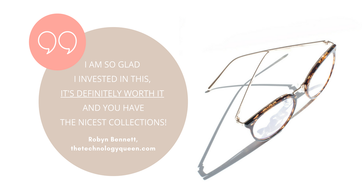
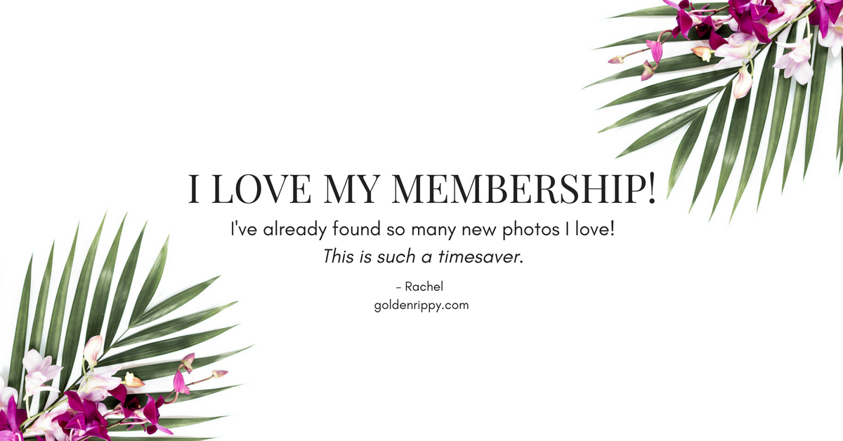
We all know that social proof can be one of the best ways to sell your offers. People want to know that they can trust you to deliver, and there's no better way to show them you're the real deal, than with testimonials from happy customers and raving fans.
Our summer collection styled stock photos can be a beautiful backdrop for your testimonial images this season.
Design Tip: Create them in different dimensions so that you can use them to freshen up your website, or use them on Instagram, Facebook and Twitter to build your credibility (while looking pretty darn haute).
Ready to start creating your own graphics?
Whatever you're promoting this Summer, whether it's physical products, a program, or a service, you can use the images from our Sand, Tropical Vibes, and Picnic collections to really uplevel your branding and create gorgeous eye-catching images in a snap!
*Please note the graphics and images in this post are for example purposes only, and may not be used without prior approval. Questions? Contact us.

