How to Repurpose Blog Post Graphics for Social Media
mAximize your blog posts by creating graphics that will help you get more traffic from social media
As a business owner it’s important to create quality, free, and useful content for your community to add value and build trust. At the same time you want to create content that has longevity, so that you can continually drive traffic to your website with that specific content months or even years from now!
We know that the desire to show up consistently on social media can lead to “filler” content, which is okay, but that may not necessarily serve your community to the maximum potential — plus it can be exhausting for you to keep coming up with new post ideas!
That’s why we’ve shared our top tips for how to market your blog posts across all social media platforms.
So you can get more eyes on your hard work, increase site traffic, and build your following!
Tip #1: Create Multiple Blog Post Covers
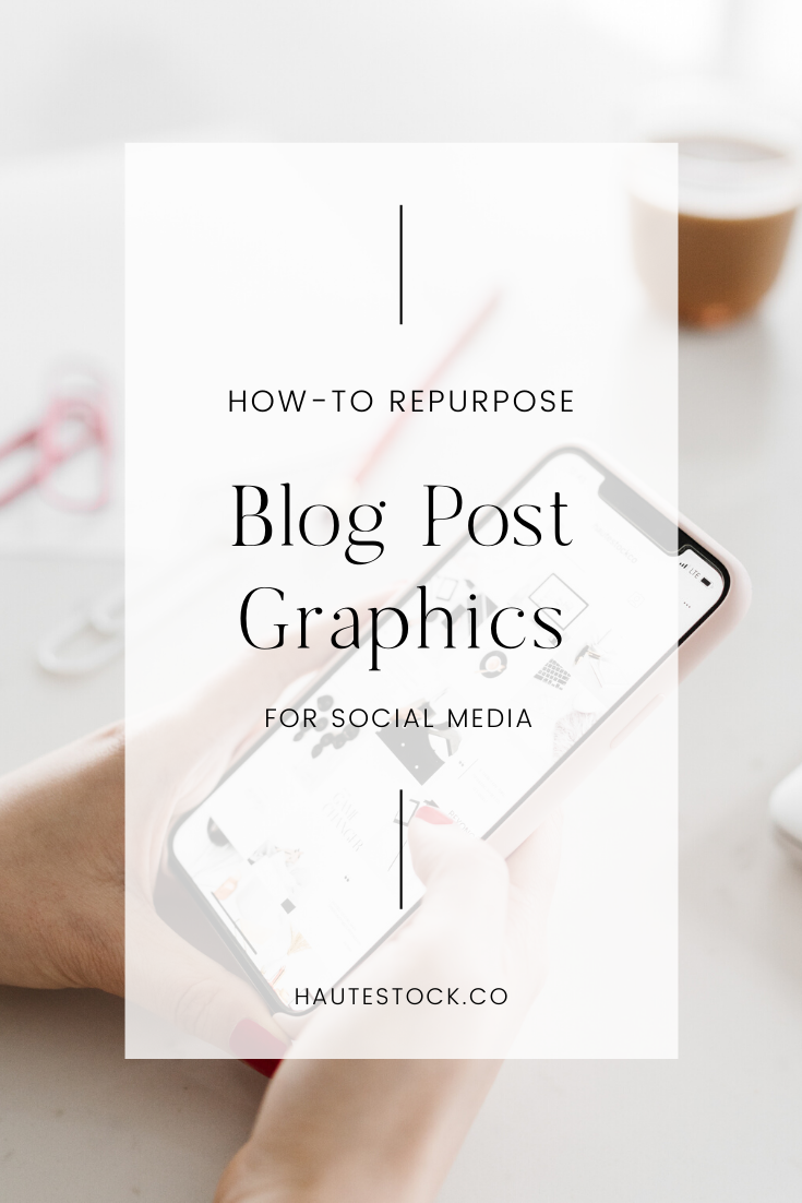
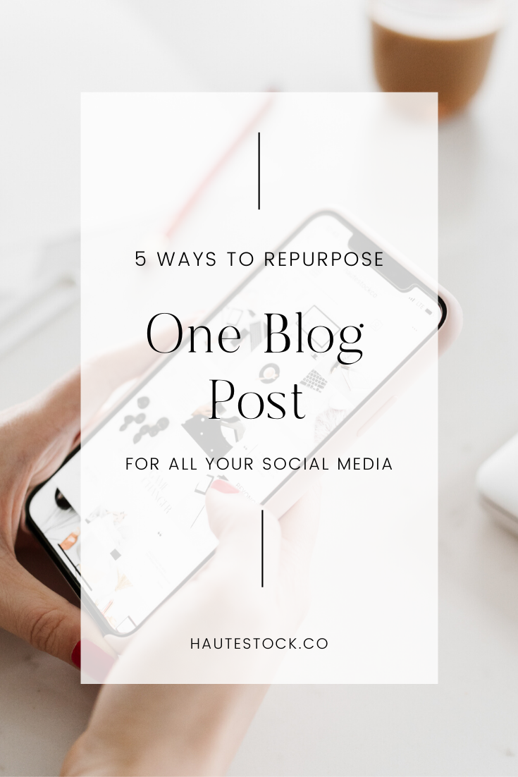
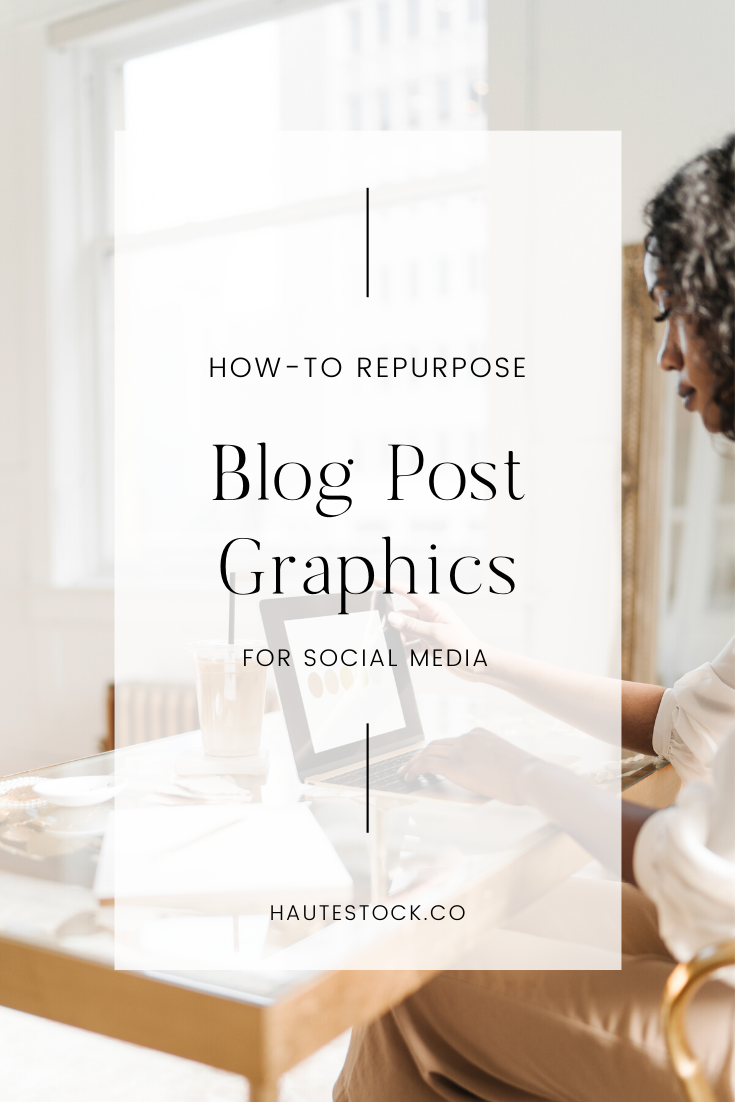
This is probably something that you’re already doing while you’re trying to create the perfect Pinterest-worthy cover for your blog post. Rather than deleting all the runner-up options, schedule the other covers to Pinterest, making sure to link back to that valuable blog post!
We use a Pinterest scheduling tool called Tailwind to shedule our posts in advance. We make sure to schedule several pins for one post to maximize its potential exposure and traffic. We don’t schedule them to all go out at the same time, rather we space them out so the post is being continuously promoted vs. once and done.
Play around with the copy on your extra blog post covers — you never know which text will be more enticing to your views!
You can also resize these covers to Instagram Stories size to post on your Stories throughout the week (and beyond) to let your followers know what’s new on your blog! Use the ’Swipe Up’ feature to make it super easy for your followers to click the link to get to your blog post (if you have this feature).
Canva’s resize tool is easy to use so you can customize your graphic to any size — just hit resize and make a copy with your new Instagram Story dimensions.
BONUS TIP: Creating a template that you use for all your blog post covers saves so much time and makes it incredibly easy to make multiple versions of graphics for one post — all you have to do is switch out your images!
Tip #2: Incorporate Graphics throughout your Post
The more drool-worthy visuals you include throughout your blog post, the more content you’ll have to repost on all your social media platforms.
Consider adding a checklist, an infographic, a moodboard, recipe graphics, behind-the-scenes snapshots, or mockup of your opt-in.
Try thinking of the images and graphics that you’re including in your blog post as sharable and pinnable content, to help you gain exposure for your post and lead traffic back to your blog.
In addition to a strong blog post cover that is Pinterest-worthy, the other graphics in your blog posts can entice more clicks because they give more of a glimpse into the content you’ll be sharing.
BONUS TIP: Make sure that you’re changing the description and file name of all the images in your blog to include your keywords and that you’re linking the image back to the correct blog post. This will make the photo SEO-friendly and increase your traffic even more.
Tip #3: Highlight Testimonials or Key Take-Aways
Are you including quotes, testimonials, or key advice to your readers in your posts?
This type of information can be broken up and used to create additional graphics for your blog posts. Each testimonial, piece of advice, or a step in your process can be used to create graphics that you can then share to Instagram, Facebook, Twitter or post to Pinterest.
These graphics are extremely important because they give you a ton of extra content to share and they’re informational, so they help establish your brand as a leader/expert in your field.
BONUS TIP: Make sure you’re including your URL on all blog post graphics you’re creating, from your blog post cover, to checklists, testimonials and key take-aways. If people repost your images, your URL will always lead views back to the original source of the content.
Tip #4: Before & After Comparisons
This tip can be extremely effective if you’re doing a tutorial/educational blog post or if you’re highlight client transformations. Everyone loves these visual comparisons!
If your blog post shares how to go from this to that then you can create a graphic that compares your starting point vs. the end result.
This can be as simple as taking a screenshot and laying out the two images side by side in a graphic that you share with a quick caption about what your post will teach them to do.
For example: A blog post all about spring cleaning can show an image of the clutter vs. the perfectly organized result.
A blog post for curating a cohesive Instagram feed can show a disorderly feed with no theme vs. a gorgeous feed with a pretty color-way woven throughout.
Tip #5: Share a Scrolling-Video
Since you’ve spent the time to write helpful and valuable blog posts, filling it with gems of knowledge and gorgeous graphics, take it to the next level by creating a scrolling-video graphic of your post.
After all, sometimes the best way to market your blog post is the post itself!
Use a screen recorder (we use Screenmailer) to record your screen scrolling from top to bottom. Grab one of Haute Stock’s desktop mockups and insert your video into the desktop screen. Either crop the image to Instagram Story size or Instagram post size and export as a video to share on social media.
Video generally gets a lot of views and engagement vs. static posts, so this is a great way to make sure you get more people seeing your social media posts and hopefully enticing them to click the link to read the post and engage with your business even more!
Check out this tutorial to learn how to insert your video into a mockup stock image.

