How to Create your Visual Strategy using Stock Photos
Images have become a huge part of social media strategy. The old adage of "a picture is worth a thousand words" can now be rephrased to a "a picture is worth a thousand clicks".
So. Many. Images. What's a savvy entrepreneur to do?
You may have product photos already in your back pocket, or some well done brand photos from a photo shoot that are share-worthy and relevant to your brand, but to really fill out your overall visual presence, you should definitely add stock photos into the mix!
By finding and using the right stock photos for your business or service, you can increase your visual consistency, attract more ideal clients, and uplevel the aesthetic of your brand.
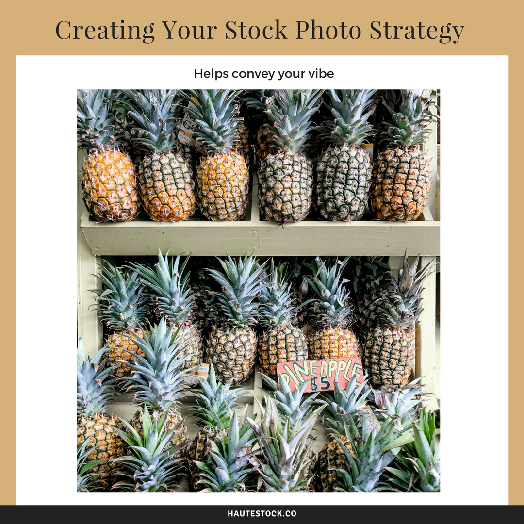
With stock photos, you can really hone in on specific images to support your messaging and provide a nice variety to your posts or feed.
Finding and organizing visuals takes some time and consideration, so we've compiled the steps you need to create a beautiful, cohesive visual presence.
We also created a free Visual Strategy Map to guide you through the process, along with examples from our Haute Stock members.
Want to take your visual strategy a step further?
Don't forget to reference our How to Crack the Image Code post where we show you how to customize, crop, and select images to enhance your brand.
Also be sure to check out How to Perform an Effective Brand Review. This will help you to tweak your overall brand style, messaging, goals, and will help you determine where you need to full gaps in your brand and overall online strategy.
Let's cover the basics first: Here are 5 initial Steps you should take in order to create a more cohesive visual presence for your Brand.
1 / Choose how you will organize your content calendar.
Tools like Google Calendar, spreadsheets, Trello, etc, will help you to stay organized and on top of all of your brand assets. Of course you can also use good ol' pen and paper too!
2 / How often will you post?
Once a month, once a week, 2x, 3x? Base this on your business model, how much time you have, what your clients expect, what your goals are for posting, and how much time you have available so you can stay consistent. For instance, you might post 1 x a week if you are posting to your blog, but you might post every day to a social account to continue to grow your following.
3 / What will you post?
You'll also need to determine WHAT you will be posting about. Think about your brand and what would be most valuable for your followers. Also think about where you are sharing what. You might want to save more personal and longer posts for your blog, and then shorter more professional posts for your social outlets. You will want to mix your messages up, so pick 6 or so "type" of posts (i.e. business offers, inspirational quotes, how you can help, customer highlight/testimonial) to start out with and you can refine them once you see what type of response you receive.
4 / Research some of your favorite brands or others in your industry. Take a look at what others are doing in your field to see if there are any things you can bring into your overall strategy. Do you see consistency in the type of images they are posting? Are they mixing it up, do they have compelling topics, do the visuals compliment their brand messaging? Take note of those you like so you can make the right considerations for your brand. Be sure to also take note of those you don't like, so you can avoid the same issues with your strategy.
5 / Find images that fit your brand and get your visuals in order.
Haute Stock is a great resource to start with when building your own visual strategy. With a variety of images in different colorways, styles, and themes (like boss lady, exercise, health + wellness, motherhood, seasonal), there are many options available in the library to get your creative juices flowing. Members can take advantage of the additional graphic packs with design elements like icons, patterns, and frames to take their visuals to the next level.
you're half-way there: Here are A few more things to keep in mind when organizing and selecting images for your Visual Strategy.
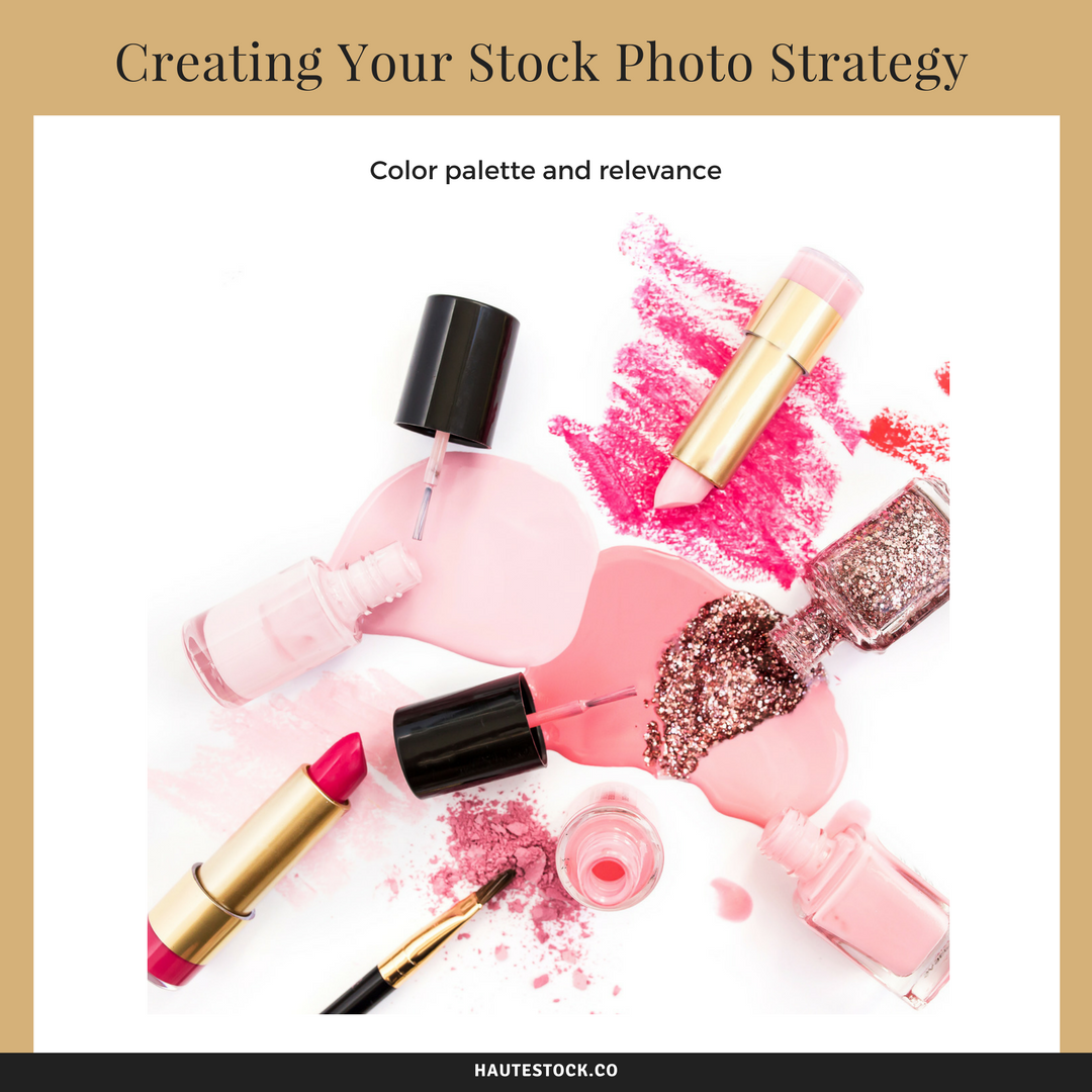
1 / Pay attention to the overall color scheme of the photos you are using.
Be sure to select stock photos that include your brand colors. Or, you can always adjust the colors of a photo with filters, gradients, or color overlays to make it better fit with your brand.
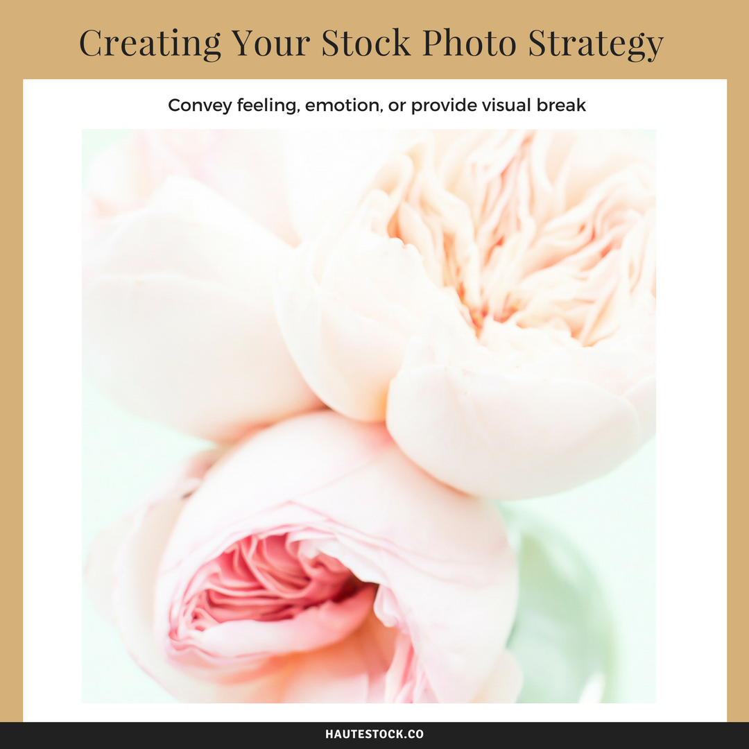
2 / Select images that are simple and can be used as background images.
These images will allow you to be flexible with your feed. You can use these for quote graphics, or you can add overlays to provide an area for you to add additional content. They'll also give you a little variety to the overall pacing of your feed.
Choose appropriate images — you may need something that is seasonal, or conveys a certain aesthetic or feeling, so keep that in mind when choosing these images.
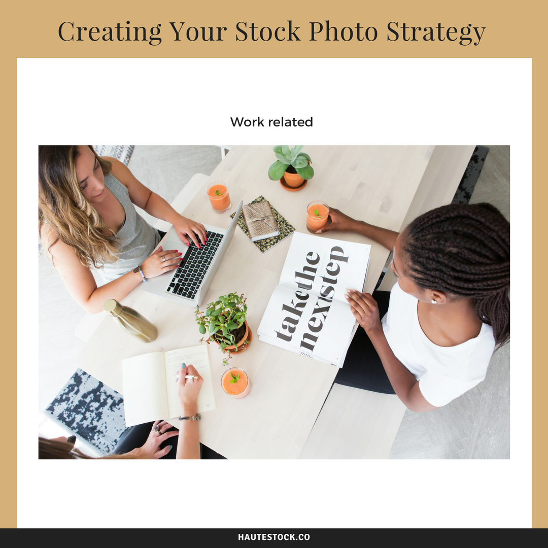
3 / Select images that fit with your target market, or can be modified to fit.
Select images with people that will resonate with your audience or that will portray a specific lifestyle. This will give you flexibility so that not every image has to be of you specifically. These image will quickly resonate with your audience and will hit on the "know, like and trust factor."
4 / Look for images relevant to your industry or messaging.
These images will give you flexibility so that you don't always have to share a product or action shot of you and your biz.
5 / Include images from your personal collection — or look like they could be one of yours.
This will help with consistency and personal influence across your graphics.
6 / Select images that can help you tell a story.
These images will look natural, and give you the option to talk about topics that you might otherwise stay away from because you don't have a corresponding image for them. Select images that look personal and natural and that fit within your personal brand style.
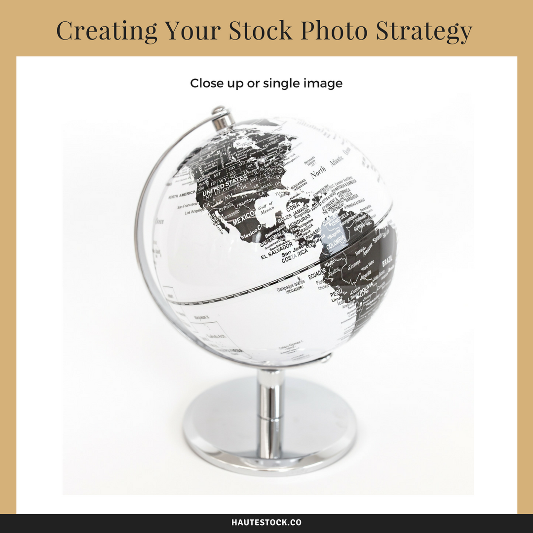
7 / Look for images with a single prop or that is close up/cropped.
These images will add a nice visual dynamic to your image selection when looking at your photos as a unit. They'll add variety so that not every image has the same crop, image depth, composition, etc., and will also allow for you to highlight specific items or topics in your messaging, etc.
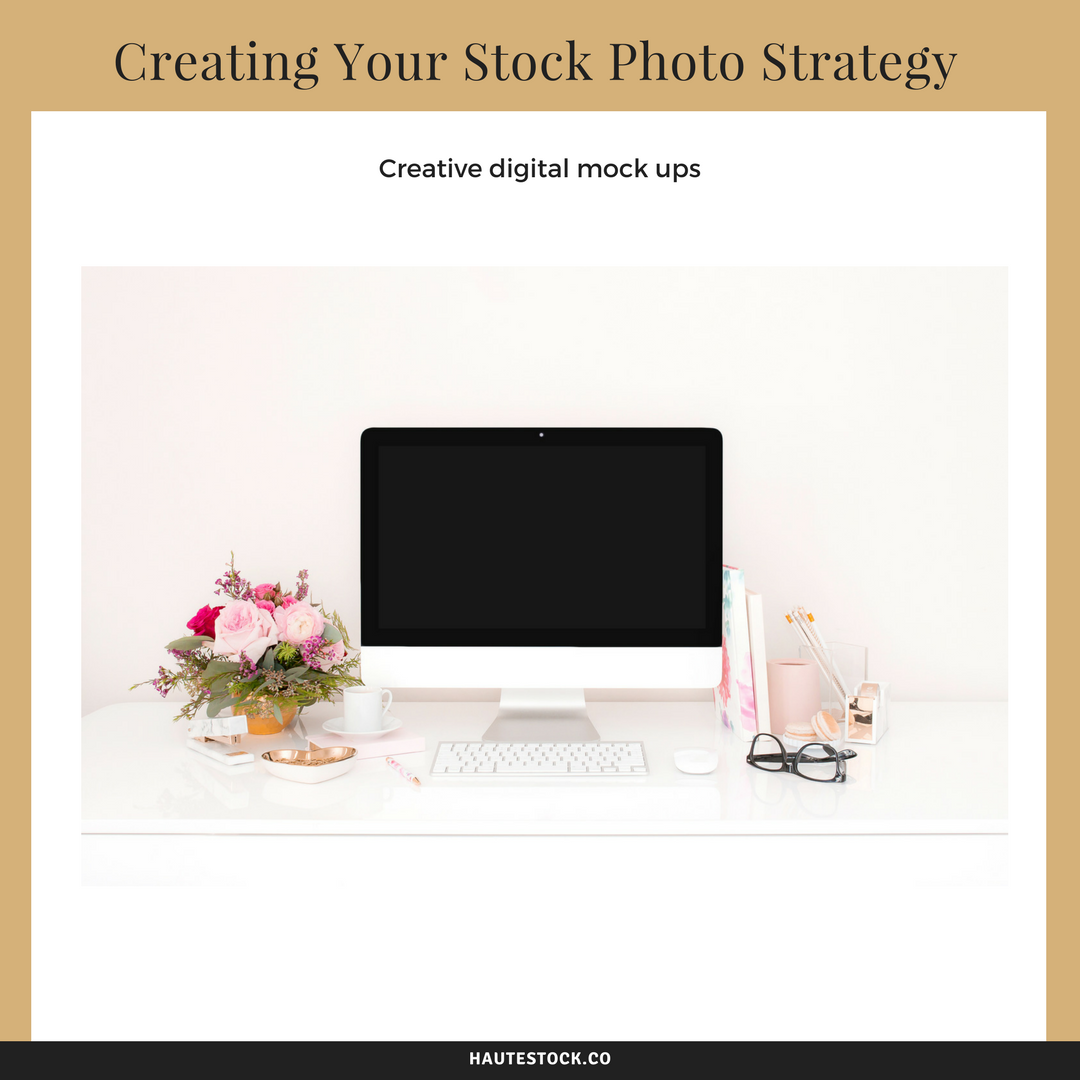
8 / Use flat lays and mock ups if you can.
These type of images will help to diversify your feed, especially if you have a service or product you want to highlight. These give a break to traditional photos as well as bring an interesting take on your specific product.
well, There you have it: all the tips you need to create cohesive visual presence for your Brand.
Because there's no denying it — images are the big hitter when it comes to making an impact with your brand!
Once you start implementing your new visual strategy and have posted consistently over a specified amount of time, you can do a brand review to see what images are working and which aren't, so you can refine your selections and get creative.
ready to take what you've learned to the next level? stay on track with our free visual strategy map!
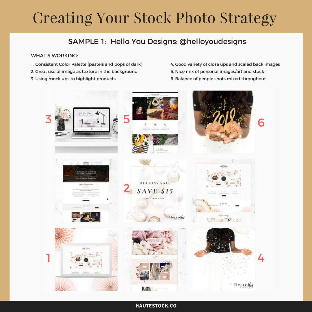
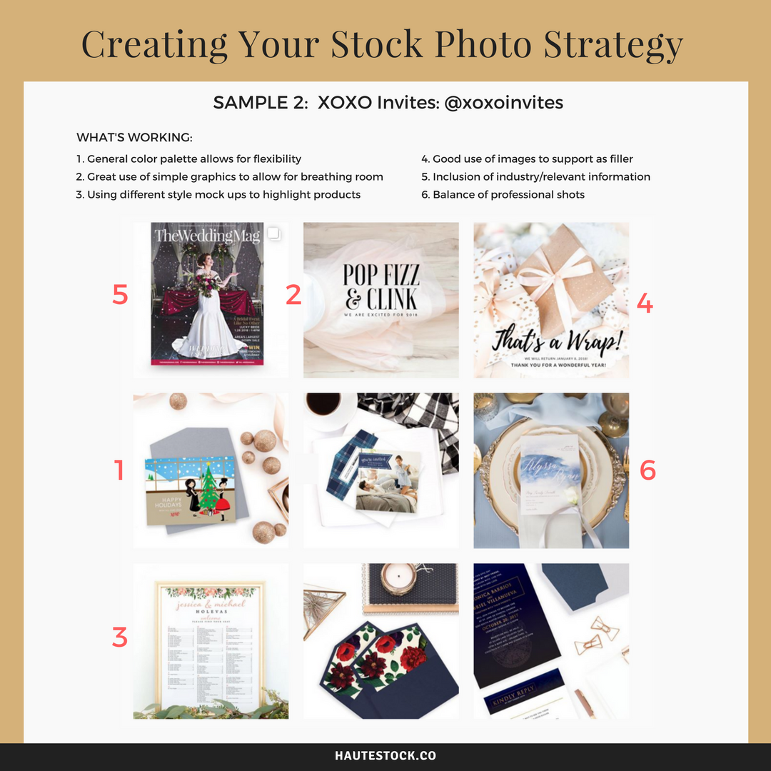
Before you run off to work on your visuals, check out these great imagery examples from our Haute Stock Members
ready to build a gorgeous brand with stock photos that make an impact?
This post was written by LeAnna Weller Smith: Executive Creative Director, Weller Smith Design & Design Expert, Haute Stock.

