10 Graphics You Need for Your Next Promotion
Need some ideas on how to promote a new product or increase demand for your services?
Let’s start with 10 graphics that will help your promotions receive the increased visibility and love they deserve. While there are many different ways to promote your offerings, below we highlight a few that can serve as a jumping off point to get things moving in the right direction.
Getting Started:
We think a great way to get people excited about your offer is to give them a taste of what working with you is like — for free. So when you're launching something new or want to promote an existing service/product, consider creating a free piece of content that you'll deliver to your audience in exchange for their email address.
When putting together your promo , always start with your target audience in mind so that you create something they really need and want. That might be an e-book, a checklist or any other type of high-quality content piece you can think of.
Figure out the BEST platforms for you to promote your offer. If you don't post consistently on Facebook, you might not want to spend the time with Facebook Post or Ad graphics. If your audience is always on Instagram and you have a great following there or want to build that up, you might consider investing your time there with posts and stories that will push your audience to your blog or direct download. If you are just starting out and are still testing the waters, don't fear (!) — the promo options below will give you a great starting point!
Create your graphics (these example graphics have all been designed using Haute Stock Styled Photos and edited in Canva), but you can use any program that you are most familiar with.
When designing your offer graphics, be sure to check in with your brand styling and be aware of what you are putting together. Are you using your brand colors and fonts? Are your pictures a good reflection of you and your business? This part is so important for brand consistency, so just review and check against your branding to make sure you are on the right track.
Schedule your posts! We use Later, but you can also use apps like Hootsuite, Edgar, etc.; there are quite a few to choose from.
Time to let your graphics get to work!
1/ Basic Blog Post Cover Graphic
Writing educational blog posts for your audience is a great way to set yourself apart from the crowd by showing your community that you really are an expert and authority in your niche.
With your offer in mind, write a blog post that will educate your audience and answer some questions/objections they may have. You may not want to mention your offer directly in the post, but what you can do is create a free opt-in to collect emails. Make this something that adds additional value, like a one page checklist of what you covered in the blog post — this is called a content upgrade.
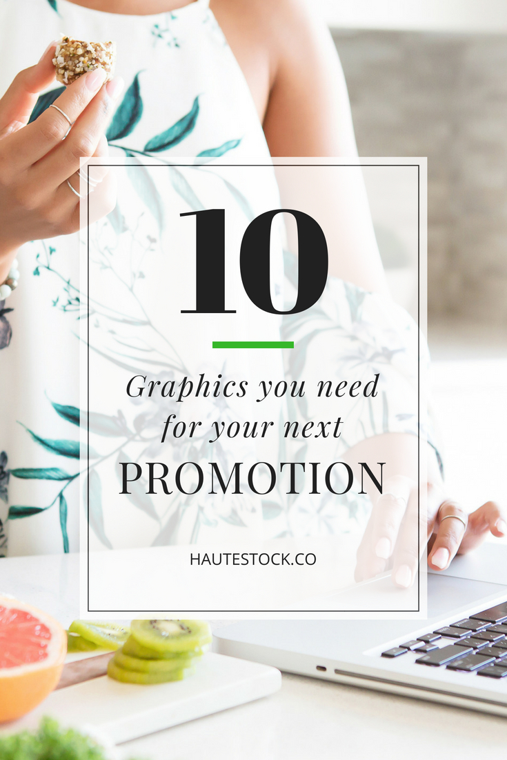
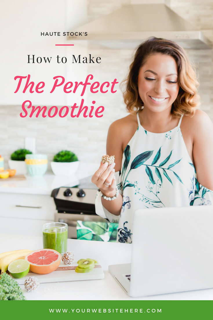
For every post you create, you should be spending time creating a Blog Post Cover Graphic. This cover graphic is going to help you get traction to your post — when someone lands on your blog, they can easily scan the graphic and be enticed to click and read the post. Be sure to pin your blog post cover graphic to Pinterest so that you have another source of lead generation to your blog from the platform.
Design tip: Your blog post cover graphic should be vertical (so that it's more likely to get pinned and re-pinned on Pinterest), and should include your blog post title + your website URL. Use a captivating stock photo for the background to really make your graphic look professional and stand out.
2/ Blog Post Call-Out Graphic
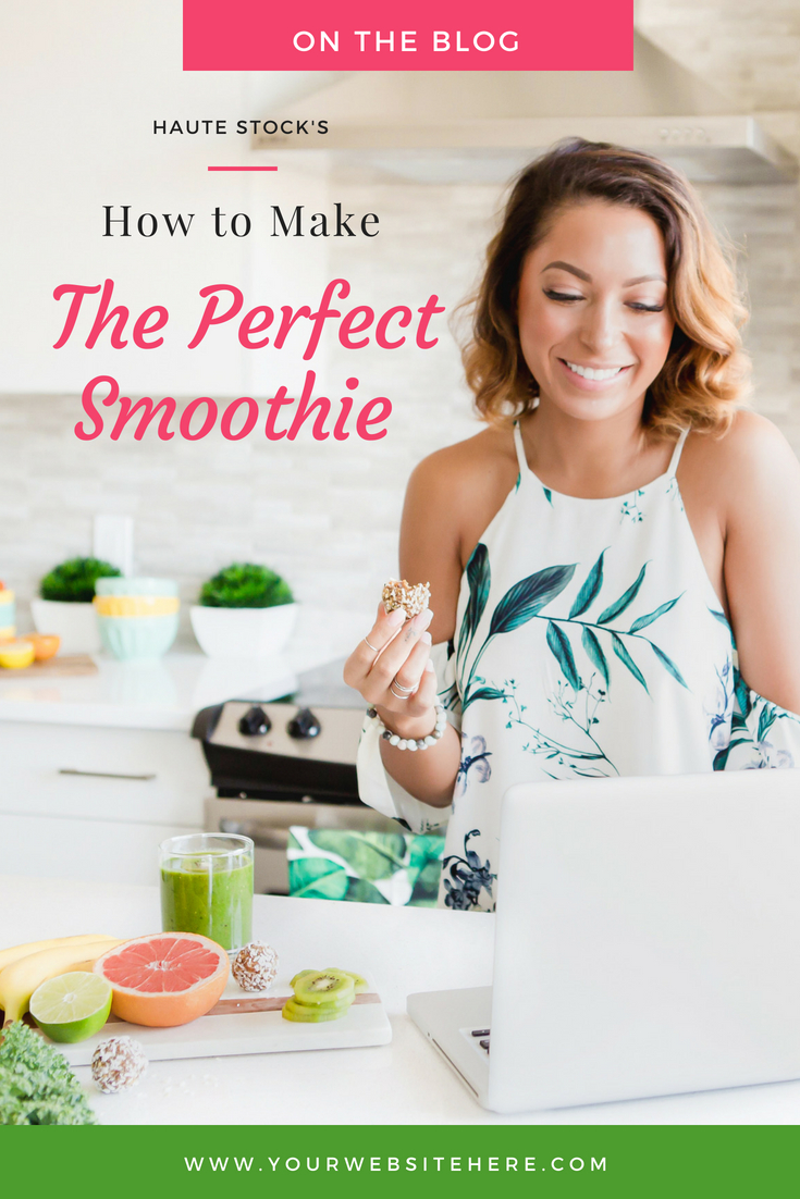
A Blog Post Call-Out graphic can also be used on Pinterest or other media outlets to push users to your full blog post that will include your content upgrade. If you're sharing this on social media, that extra pop of text and color on the graphic will grab the viewer's attention.
Design tip: To create this graphic, simply use your Blog Post Cover template, but add a box at the top that says "On the Blog" or something similar. Be sure to use a bold color or an overlay of some kind to really draw attention to the text.
3/ Promotion Box
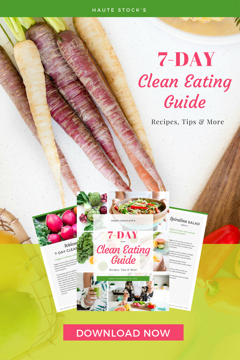
A Promotion Box gives you the flexibility to include the opt-in or download on other blog posts or within different areas of your website and online.
You can also use it within the blog post where you're offering the content upgrade. Put your promotion box near the top of your post and then again at the bottom. That way, if people are scanning your post or only read the first little bit, they're still likely to click on your opt-in offer.
Design Tip: Be sure to use colors that will draw the eye in and be clear with the call to action. If this graphic will be placed somewhere other than your blog, be sure to include your website address.
4/ Side Bar Promotion Box
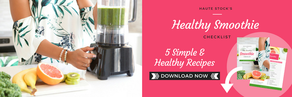
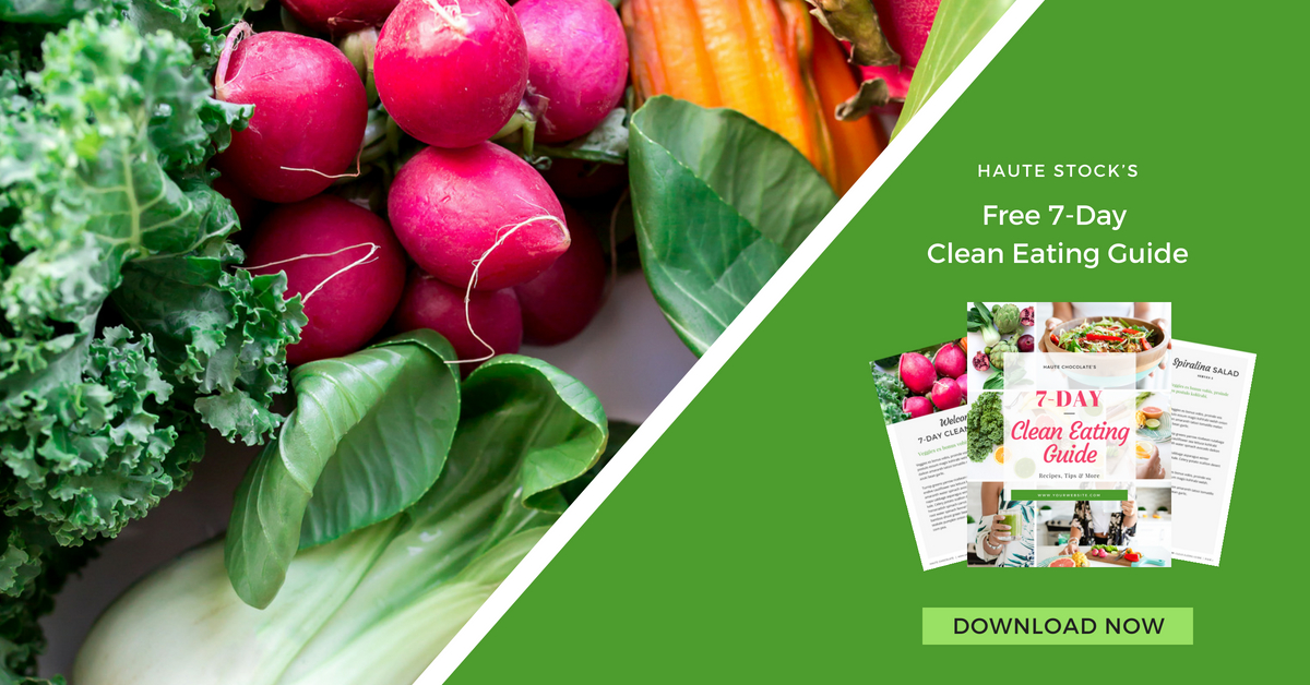
A Side Bar Promotion Box gives you further flexibility when promoting your offer. You can put these within your blog on specific pages, or use as an ad on other blogs, etc. If this graphic will be placed somewhere other than your blog, be sure to include your website address.
Design tip: Adding in a sample of your opt-in to the graphic (like we've shown below) will really entice your readers to want to click — it shows them what they're missing if they don't download the content you've created. Create a "Download Now" button by adding a colored rectangle. This will immediately draw the eye to where you want it to go.
5/ Pinterest Graphic - Simple
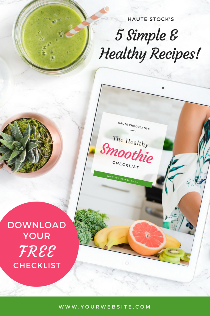
Keep it simple with a clean Pinterest graphic to spark your audience's attention. These pins don't show off the full promotional item, but can provide a “hint” of what is to come with a styled cover graphic or related image. You can use a “Simple” layout for any social media post that you create, this doesn't just apply to Pinterest posts.
Design tip: Be sure to have a clear call to action for best results, like we've done below by adding the circle element in a bright color. There's no question what we want our audience to do — download the free checklist!
6/ Pinterest Graphic - with Content Upgrade
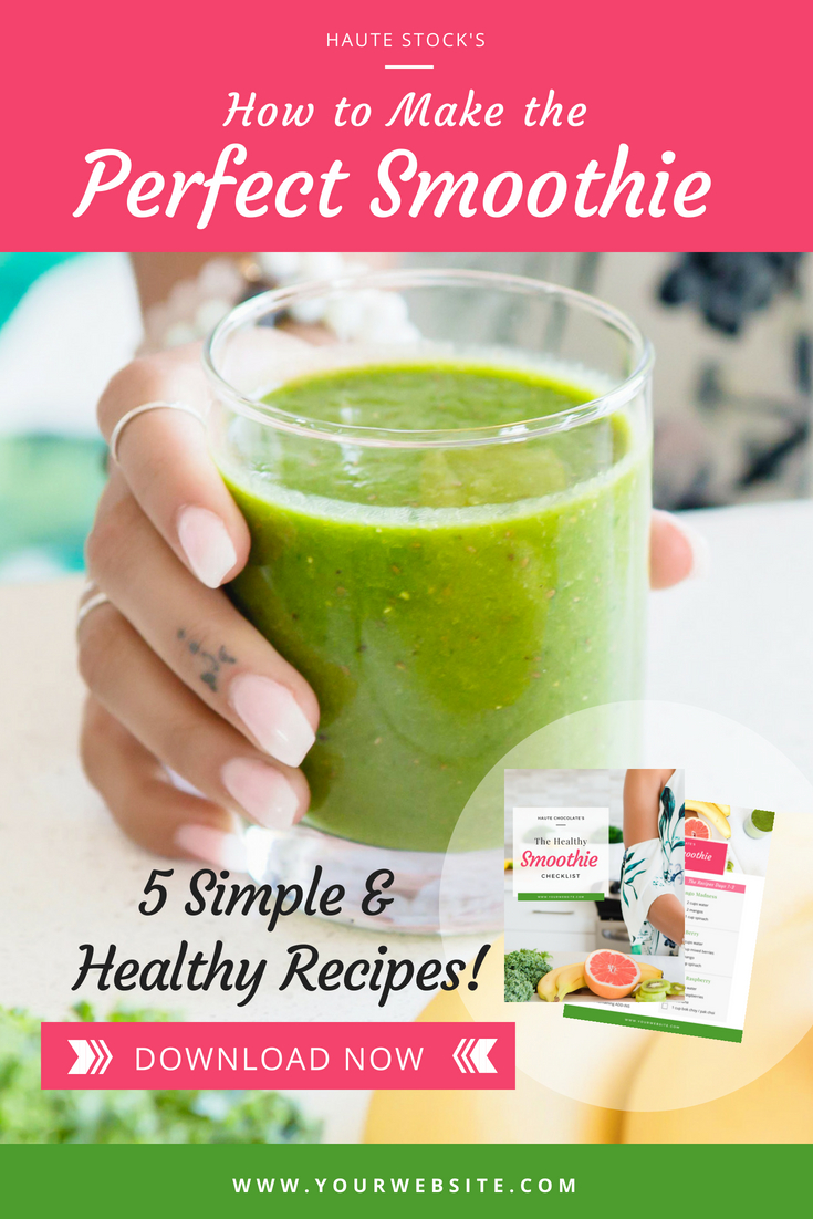
Pinterest Graphics with Content Upgrade messaging actually show what you are offering to your audience. This can be an e-book, checklist, or any other content item that you know your audience needs.
Similar to the Side-Bar Opt-in, by including a picture of the content, you're giving your audience a sneak peek into what they will be receiving from you.
Design tip: Make these pins attention-grabbing by using relevant imagery and a nice size version of your promotional item to draw them in. Again, you can use a “Content Upgrade” layout for any social media post that you create, not just for anything Pinterest related.
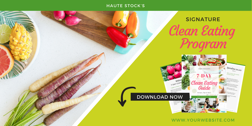
7) Pinterest Long Graphic
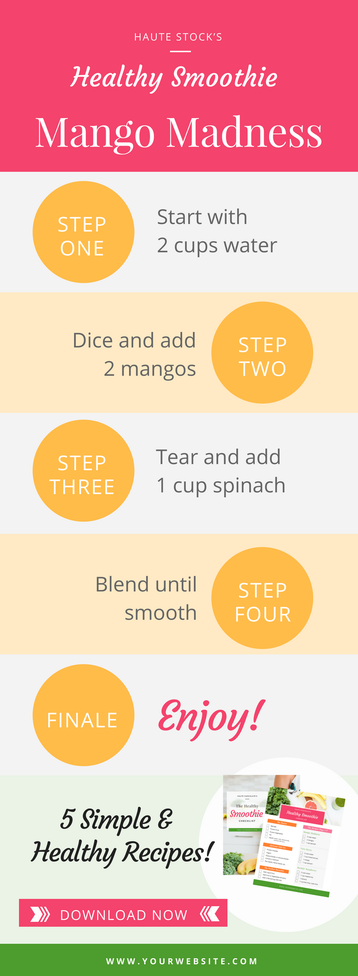
Long Pin Graphics can be a lot of fun! They are a great way to highlight your offer or service in a creative and eye-catching way. They easily grab your audience's attention because they take up more real estate on the page and you can make them even more “pinnable” by offering great content in a visually compelling layout. Be sure to always share something useful that will have them wanting to see more.
8/ Facebook Ad
If you are venturing into Facebook Ads, or any other sort of online Social Ad Space, be aware that most have a 20% text rule. This rule is where there cannot be more than 20% of text on your ad, otherwise, it might not appear for many of your target audience. Be strategic with the content you provide, since you can always include the bulk of your messaging in the Ad copy that accompanies the graphic.
9/ Instagram
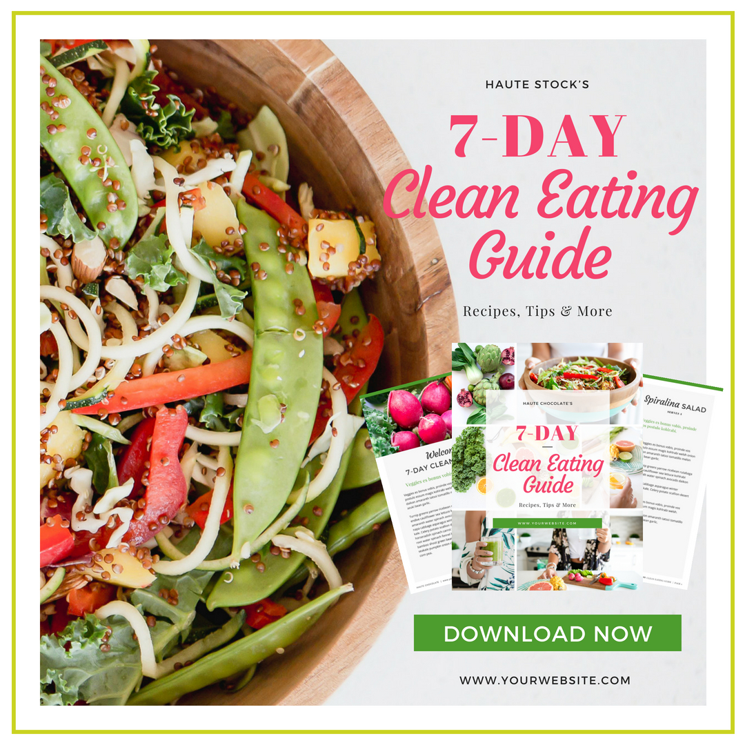
Instagram is another great way to reach your audience. You can use a “Simple” or “Content Upgrade” version as mentioned in items #4 and #5 above to promote your offer.
Design tip: By creating a square graphic, you can post not only on Instagram but also on Facebook — cutting your design time down while still reaching your audience on all both social media platforms.
10/ Twitter
If you like to tweet, then you'll want to include a Twitter graphic to promote your offer as well. Even though there is a limited amount of characters for your actual Twitter post, it is great to include an eye-catching graphic in your feed.
There you have it, 10 Graphics You Need for Your Next Promotion! We hope these gave you some inspiration to start putting together your upcoming Promotion Plan.
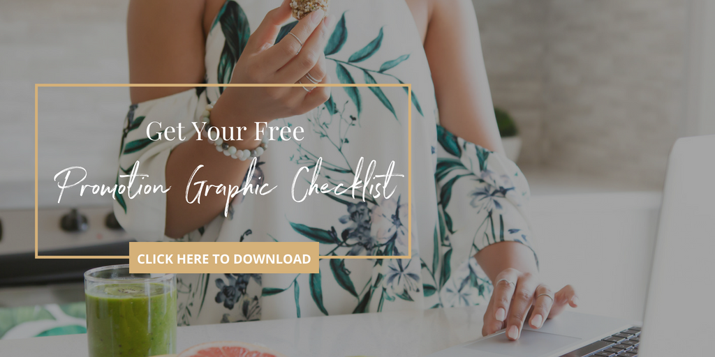
To make your next promotion a breeze, we have created a handy PDF Checklist for you to use while planning to make sure you've covered all the graphics you need. Download now and enjoy!
If you want to get your hands on the images from our Nutrition Collection used in the graphics above (and over 2500 other stock photos), then become a Haute Stock Library Member now!
This post was written by LeAnna Weller Smith: Executive Creative Director, Weller Smith Design & Design Expert, Haute Stock.

