Where & How to use Stock Photography on your Website
featuring examples from Wordpress themes by bluchic
When I first started my business, I remember looking for the perfect theme for my website to showcase my work, and found myself oohing and aahing over Bluchic’s beautiful, feminine Wordpress themes.
That was several years ago, and Bluchic* is still creating those stunning, functional themes for women entrepreneurs. Kathie and Andrew, the wife-husband duo behind Bluchic, develop Wordpress themes that combine beauty and niche-specific layouts needed to convert prospects into paying customers.
Kathie has been a long-time member of Haute Stock, and I just love the ways she’s been using our images as mockups for many of Bluchic’s Wordpress themes!
Need a website makeover or tips on where / how to use stock photos on your website?
Below are some ways Kathie dressed up Bluchic’s themes with Haute Stock images to really bring them to life.
1 / BANNER IMAGE
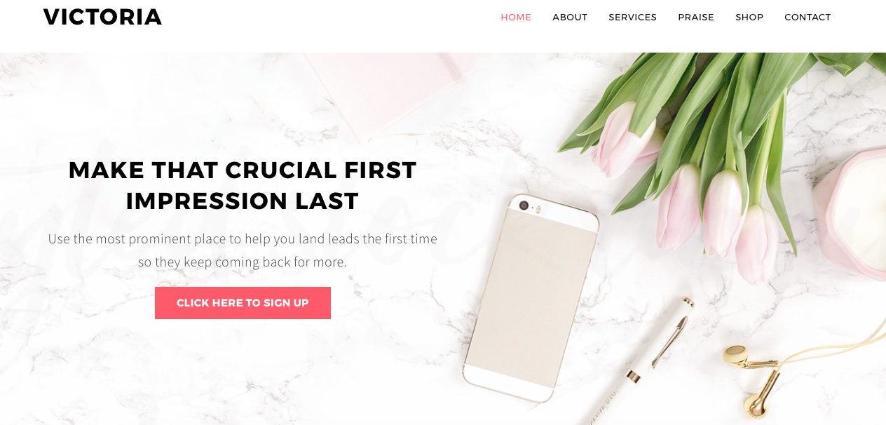
One thing I love about Bluchic's Victoria theme is the full-width banner.
Using a full-width banner image is a great way to welcome your audience to your website. It's the perfect space for your most important messaging or call-to-action.
For example, the photo below fills the user's screen, but the white space on the left side of the image makes the text pop so that the call-to-action is easy to view.
Want to implement something similar on your website?
Choose an image that reflects your brand colors and feel — after all, this image is going to leave a lasting impression on your audience.
For a clean and simple look, choose an image that has lots of white space like the one above and add your call-to-action.
If you like images with lots of props and minimal white space, make your call-to-action stand out by adding an on-brand colored banner or simple shape that'll highlight the text.
2 / LANDING PAGE
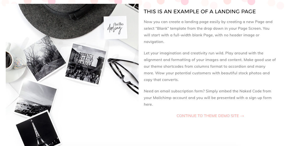
Want to let you audience know about a new program or challenge before they enter your website? Utilize a landing page to #stopthescroll, like Bluchic’s Adelle Pro theme.
Landing pages are also perfect for when your website is under construction but you still want to let people know what's coming or to capture email addresses.
Don't just use text — spice up that landing page by using a stock photo that really shows off your brand or complements messaging.
3 / BUTTONS
Every website has buttons. Done right, you can add some extra flair and brand personality to your website design.
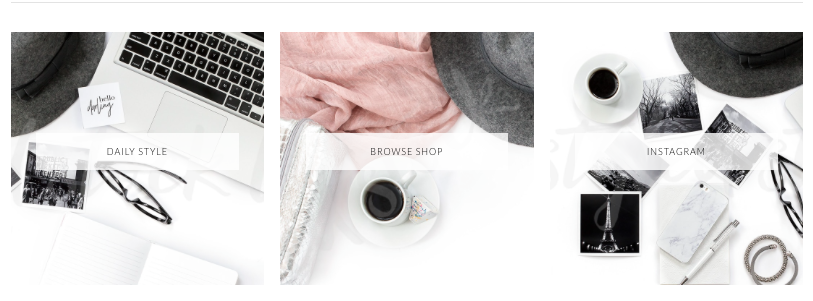
Direct your audience to areas of interest on your site by pairing an image and text. Choose which pages are the most important to share with your readers and select a stock photo that relates to your branding and/or topic. Add the desired text and link the images.
Add buttons on your homepage to make the navigation of your website easier for your readers and to further curate your brand's visual identity.
Check out the examples below from Bluchic's Isabelle theme and Adelle Pro theme — the additional menu buttons create visual interest and further define brand identity right on the homepage.
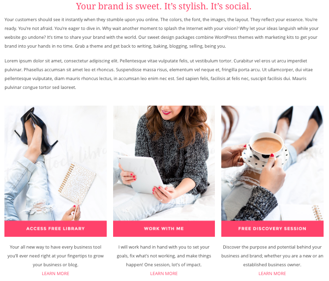
You can also add buttons to show off the services you offer. Choose the perfect stock photo that fits your brand and service type and add the appropriate text. If possible, pair the image and the text so that they complement each other and evoke a particular feeling or experience.
The buttons below are from Bluchic’s Jacqueline theme. At a quick glance, they simply give off a chic vibe. But if you take a closer look at the image and text used in ‘Work with Me’, the photo tells the story of the service and what to expect from it: professional, one-on-one, focused, communicative, and personalized.
Here’s another example of buttons using a desktop icon. In the Victoria theme, Bluchic went one step further by inserting a stock photo in the monitor and overlaying a transparent on-brand colored background and on-brand fonts.
It makes the icon that much more visually interesting and is a great way to use imagery throughout your website.
Love a stock photo that doesn’t have a lot of white space?
Don’t stress, you can make buttons, posts, banner images, etc stand out by adding on-brand colored overlays to make that perfect image work whenever you need it to. It's super easy to do in a photo-editing tool like Canva or PicMonkey.
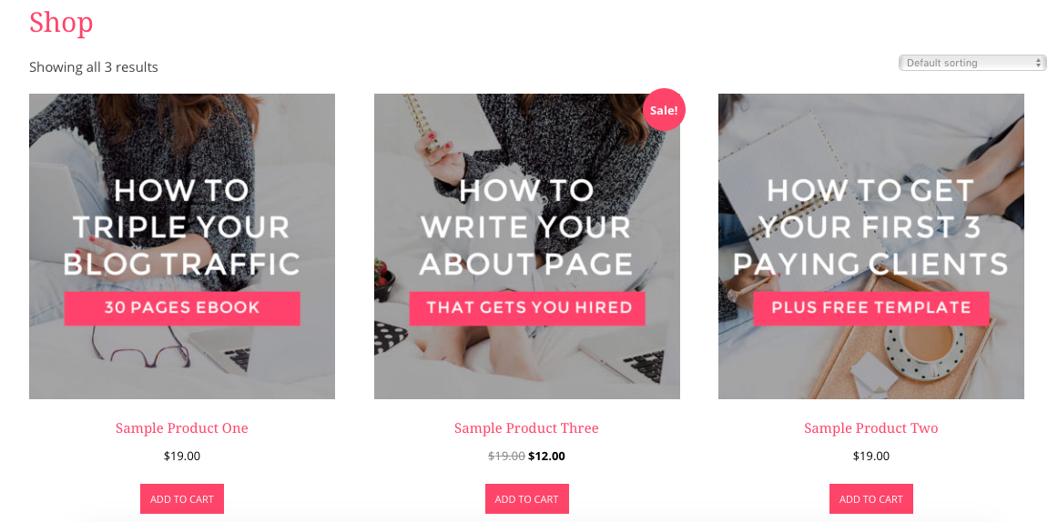
4 / Shop Listings
Have you thought about using stock photos for your shop listings?
If you sell products, you can use one of our various product mockup images to create captivating and professional looking listings for your shop.
Even if you're not a product creator but are selling courses or services on your website, using stock photos can work for you.
Instead of simply using text or an icon, consider using a stock photo, and adding in fonts and colors that are on-brand to create a shop listing.
Check out the example below from Bluchic’s Jacqueline theme to see how your online shop can be visually interesting and cohesive with your brand identity.
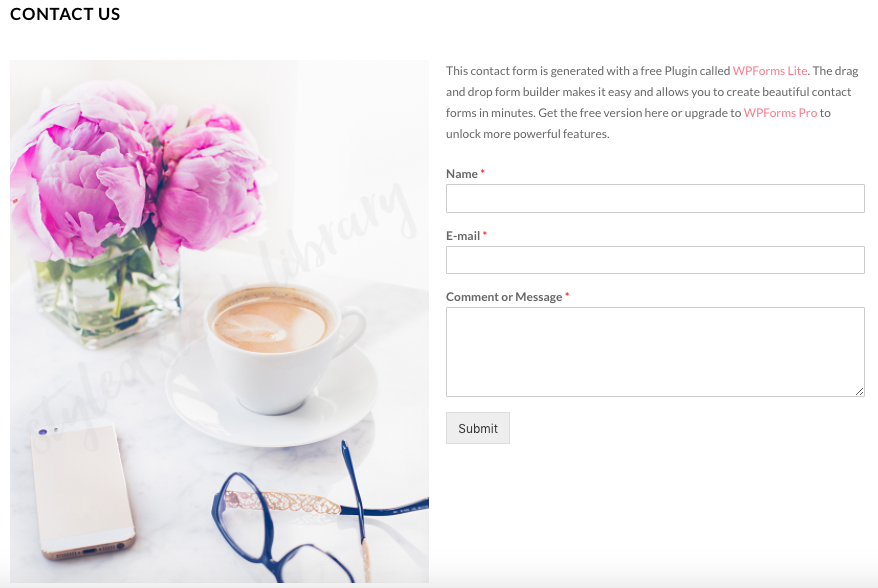
5 / CONTACT ME PAGE
A 'Contact Me' page will lead your audience to a designated space on your website to write you a message. Invite your visitors to email you if they have questions, for more information about a service, or simply to drop in to your inbox to connect further.
Your contact page doesn’t have to just be those boring blank fields — dress it up a notch and add an on-brand stock photo for another opportunity to show your audience what your business is all about.
Just check out how inviting the Isabelle theme's 'Contact Us' page is!
As you can see from our examples of Bluchic's themes, there are so many ways to use stock photos on your different website pages.
With the right stock photos, you can easily create a cohesive, curated design that shows off your particular brand identity and lets the reader know what to expect when they visit your website.
From your homepage to sales page to contact page, the perfect set of images can not only make your online presence beautiful, but will also clearly represent what you and your business are all about.
Need more tips on how to use stock photos for your business (not just on your website)? Here are 10 different types of graphics to create.
You can also make your images more unique to your brand by:
Here’s what Kathie has to say about using Haute Stock’s images for her business:
One of my best investment in biz is, hands down, getting a subscription to the Haute Stock Library! I love how Rachel always comes up with a different theme/topic and color scheme for the collection, from lifestyle to flatlay and more. That way I get to use the different collections of images for different WordPress themes on my shop based on the niche, such as for beauty bloggers, lifestyle bloggers, coaches, etc. It really helps to bring out the personality & design from each of my WordPress themes and eventually grow my business!
Need stock photos that reflect your brand personality?
sign up for hautemail and get 21 free stock photos!
*This post contains affiliate links. Every once and a while I share affiliate links for products/services that I've tried and loved, and Bluchic's themes are definitely some of my favorite feminine Wordpress themes! *


