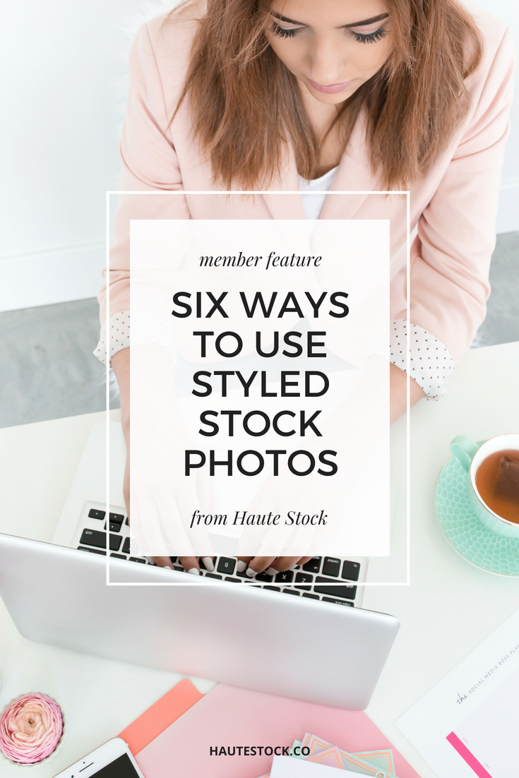
Six Ways Haute Stock Members are using our Brights Collections
I gotta say, I love my job. Not only do I get to create pretty images with the cutest props, but then I get to see how my members use them!
It may sound silly, but I get so excited when I come across an image from the Haute Stock Styled Library being used by one of our members.
Our Brights collection has been really popular since we released it, and I just had to share these six awesome ways members have been using those images for their business!
1/ Website Header & Newsletter Opt-in
Dalia / modernpinkpaper.com
I love how Dalia has used this image to create this opt-in for visitors to her site. Though the image has no negative space, her font and color choice make the text pop and easy to read.
This photo also fits well with the content on her site, since Dalia creates adorable invitation, cards and art print designs. This photo makes it look like she’s busy at her desk, in the process of creating your design!
2/ Landing Pages
Stephanie / learnyourblog.com
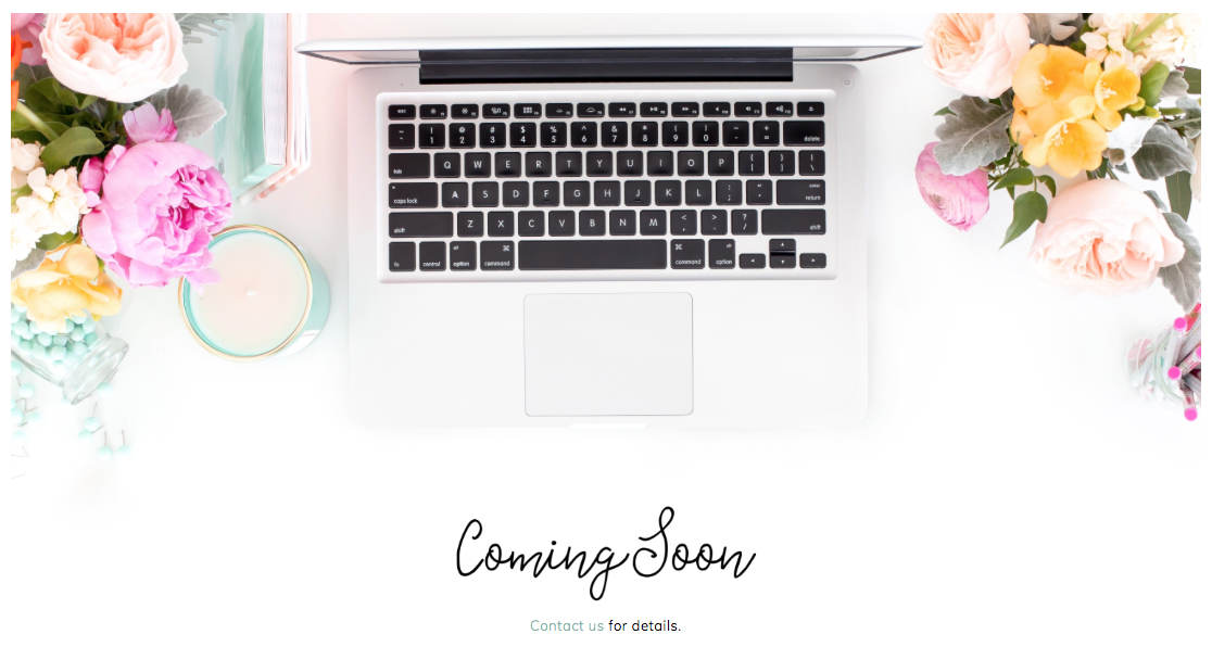
Stephanie’s newest project is still in the works, but I love how she’s used this particular image for her landing page to let visitors know all the juicy details are coming soon.
It's really easy to pop a stock photo in the background of a landing page to make it more interesting than a solid background. Doesn't it just make you want to click on contact her to find out what's coming soon?!
3/ Blog Post Featured Images
Penny / bypennyward.com
I really believe in the power of imagery to convey your message, but sometimes there’s the perfect photo that matches your words and together they speak volumes.
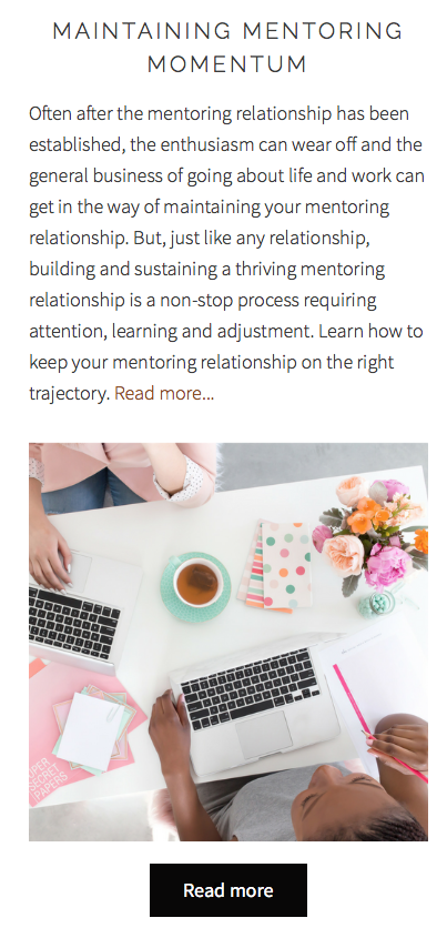
Penny used this image from our Brights Workday collection for her blog post about maintaining your relationship with your mentor(s).
The Bright Workday collection is one of our first sets of images that features women co-working / collaborating together, and this is particular photo really shows off the theme of the blog post, with the two women engaging and learning from each other.
4/ Sales Page Image
Kimberly / cupcakewebsite.com
Kimberly has used several images from our Brights collection on her website, and it looks great with her fun and vibrant brand colors!
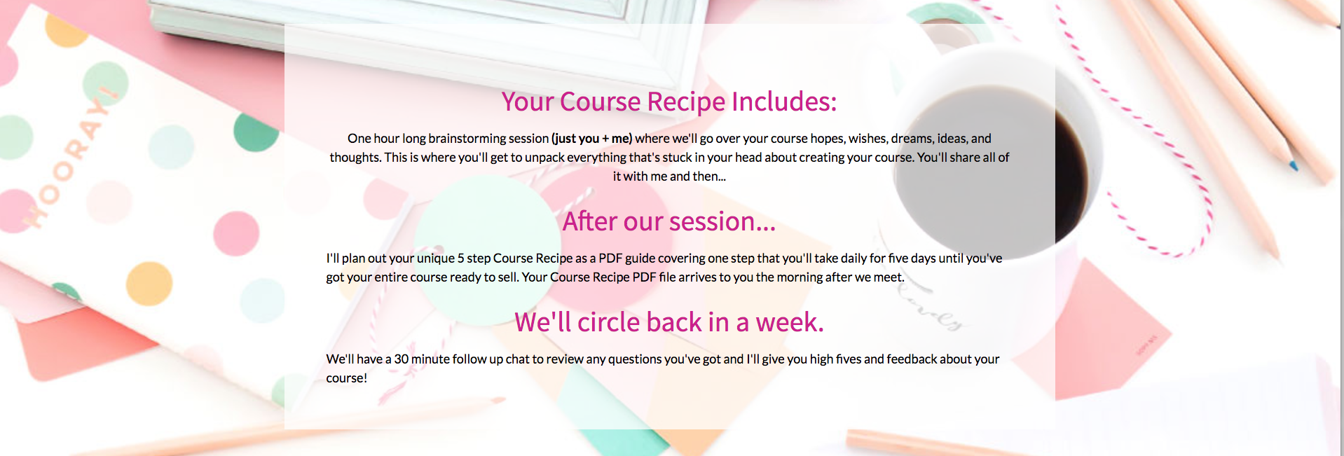
Kimberly used the Brights Collection image to breakup her sales page and make it a little more interesting. Here she's used a transparent overlay and added text overtop to create an eye-catching and unique graphic.
5/ prints, invitations, and card mockups
Kit / rubyandpearlpress.com
Kit creates wildly cute and creative designs for mugs, cards, prints, and more. I love how she used this card mock-up (or any of our mock-ups!) to feature this funny ‘New Baby’ card. I’m biased towards my babies and pandas playing in snow, too. ;)
6/ Inspirational Quote Images
Ginny / ginnykrauss.com
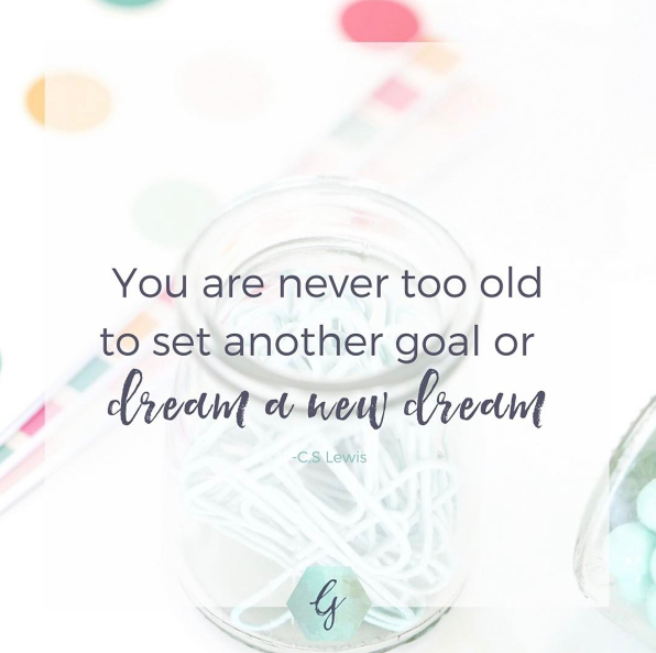
Everyone loves inspirational quotes, and I just love how Ginny used this image from our Brights collection to create this motivational social media graphic.
She added a white overlay + the quote in her brand colors and fonts + her logo to the image to make it on-brand for her biz.
These are just a few examples of the gorgeous and creative ways a few of our members are using images from the Haute Stock Styled Stock Library.
If I missed how you’ve used the Brights collections to create awesome graphics for your business, link to your website below. I’d love to check it out!
We released several collections in this color scheme, so if these are your brand colors, get excited!
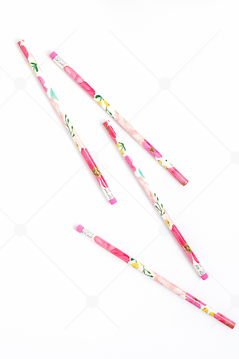
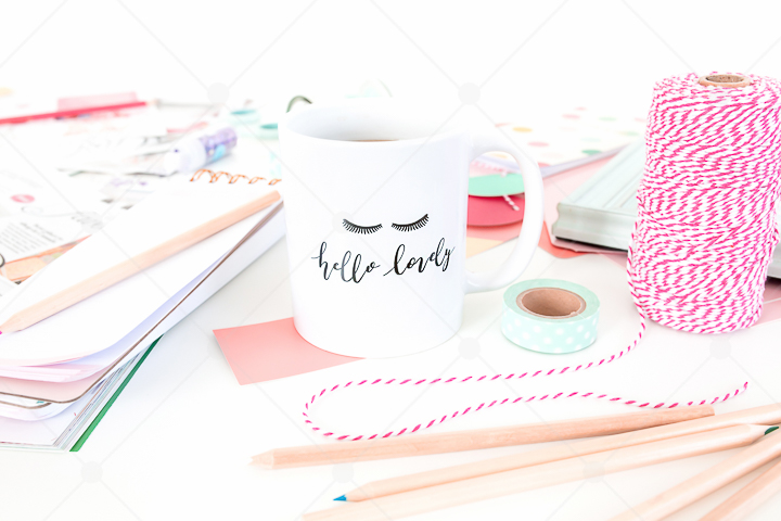
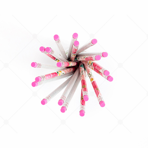
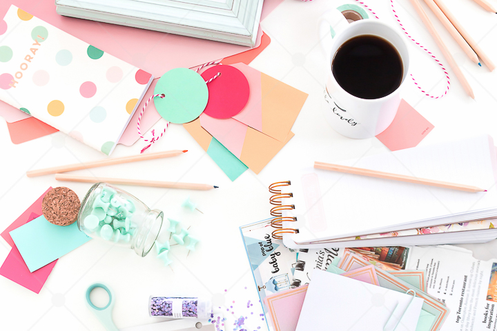
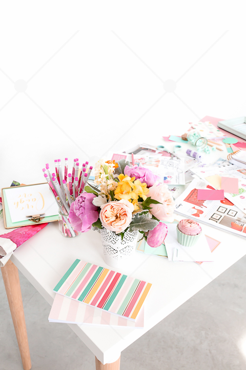
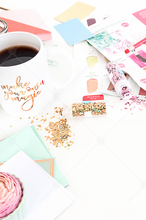
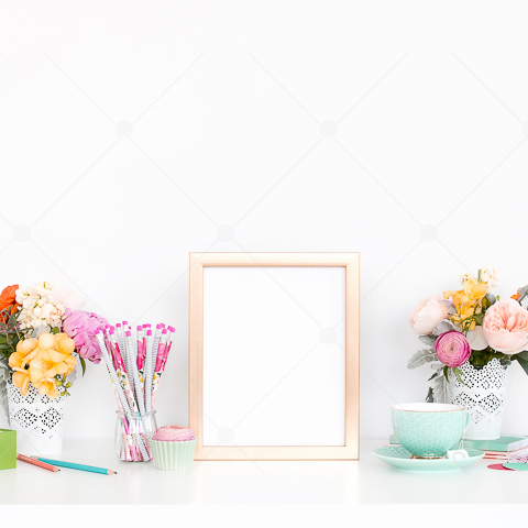
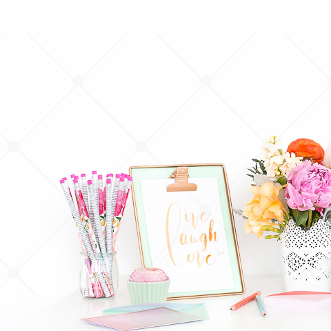
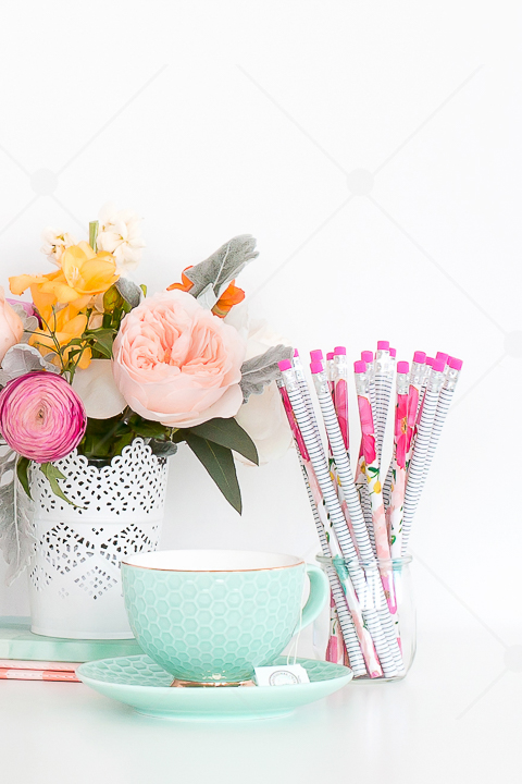
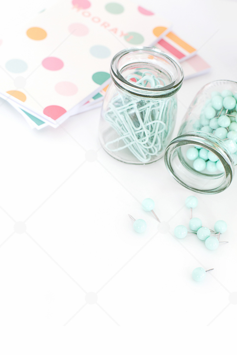
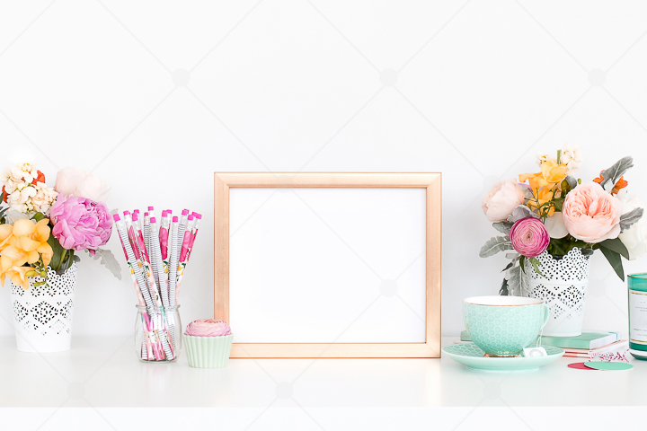
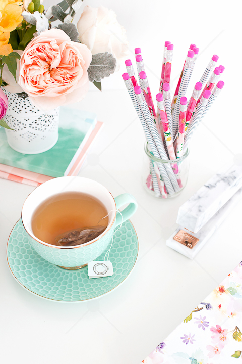
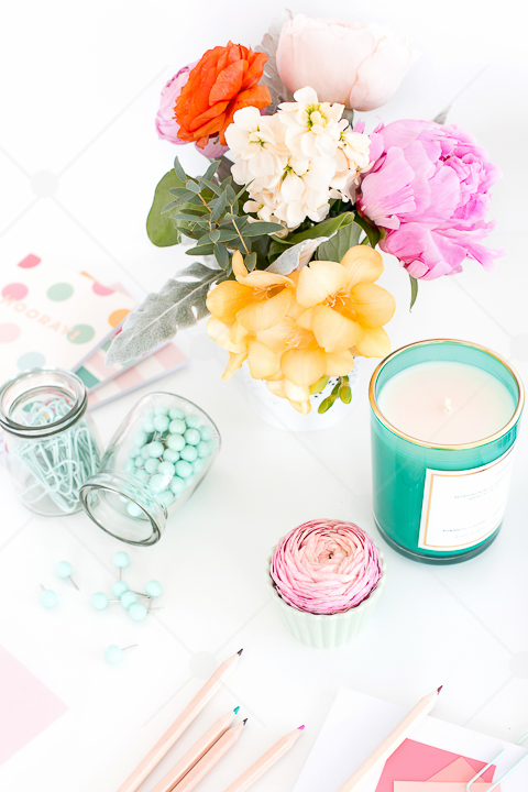
Here's a preview of some of the images in our Brights and Brights Workday Collections
Can't wait another second to get your hands on all the images?
Sign up now to become a Haute Stock Member and get these, and over 2500 other images instantly!

