How to create your Brand Style Guide, Why You Need it, and the Must-Haves!
Have you heard of a Brand Style Guide, or have you seen them on Pinterest and other blogs? Have you wondered how they are put together and how they can be used?
Well, look no further! We are going to break down all the pieces, PLUS give you a easy-to-use blank style guide template for you to set your very own up in a hot minute.
Let's dig in and get started!
We all know that building a business is not a small endeavour, and creating a brand for your business can prove to be one of the most challenging aspects of the process.
To truly build a brand that you believe in, love, and want to nourish takes time and consistency. And without a consistent overall look, feel, and voice, you could have the most wonderful brand or product in your industry, but it'll get lost in the sea of sameness.
In order to stand out, you'll need to organize yourself and your brand assets to ensure that you are keeping up with the integrity of your brand that you have been working so hard to create. That's where a brand style guide comes in!
What exactly is a Brand Style Guide?
A Brand Style Guide is a collection of the core items used to represent your brand across any and all touch points. It can be delivered in different formats like a one-page document or a multi-page reference guide with specifications, it could be interactive, and more. As you can see from some of your own fav brands, they have a consistent look and feel across the many ways that you come in contact with them. This not only continues through their aesthetic appeal, but also their messaging and more.
Why do you need one?
A Brand Style Guide has many uses — the main being to help provide consistency across your brand. For instance, if you're having a photographer take brand photos of you, a style guide will come in handy for them to get the gist of your brand and its visual vibe in one glance. You can also use it to choose what to wear and how to style your shoot. Or, if you're trying to pick out stock photos for your visuals, you can use your guide as a reference point to make sure the images you're choosing are on-brand.
It also serves as a guide as you grow your brand to keep you from straying too far from your core elements. And if you have a Virtual Assistant, you can pass this document off to them and they can pull together graphics seamlessly for your brand saving you lots of energy, time, and moolah!
The Must-Haves
There are a few different things you should always include on your Brand Style Guide, and below are our top 6 suggestions. If you don't have all of the items listed below, no worries — you can always fill them in as you get more familiar with your brand, or you can substitute other items to fill yours out with a more personal touch that makes sense for you.
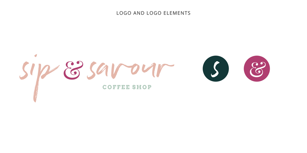
1 / Start with Your Logo
If you already have a logo that you love, that's the best place to start. You can include your logo at the top of the guide and include any variations or logo marks that have been created for your brand.
Pro Tip: If you don't have a logo and are just starting out with your business, then we suggest starting from the bottom of the Brand Style Template and work your way up this list.
Why? So that you start with photo inspiration and then work your way up the sheet to help you clarify your brand. Then you can use the work you completed with your designer to create a logo you love and one that fits within your overall design aesthetic. You don't have to hold off of your creating your own Brand Style Guide even if you're in the beginning phases of your business!
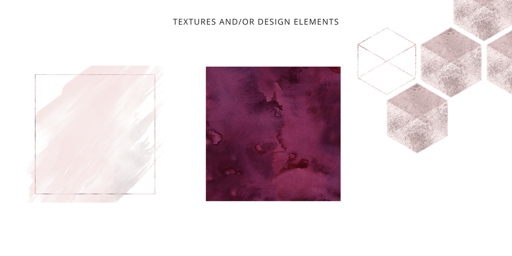
2 / Textures and/or Design Elements
Additional design elements can help to further clarify your brand and make you stand out among others in your industry. Don't use textures and design elements just 'cause — be strategic with them and select those that compliment your overall theme. Be sure to select elements that can be used in a few different ways, like icons that can be used faded back behind text blocks, overlays that can draw the viewers eye in, etc.
Pro Tip: The Haute Stock library has a variety of Graphic Packs in different colorways, themes, and styles, so you can pick and choose the elements that compliment your brand! The textures and elements used in this post are all from the Graphics Packs inside the Haute Stock membership library.
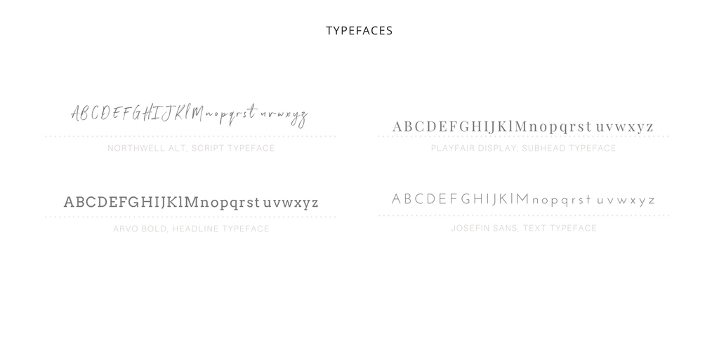
3 / Typography
If you already have a logo, chances are you have at least a typeface or two that you're using often or have paired with your logo to get you started. Be sure to include these on your style guide, along with a type sample and the name of the typeface. If you are using the typefaces for a specific part of your brand content like titles, text, etc, also mention that on your board so that whoever comes in contact with this guide knows the details of how you expect these typefaces to be used within your brand.
Pro Tip: Need some type inspiration? Revisit our Video Tutorial: The Art of Choosing the Right Typeface to get you started or if you are looking to refresh your type palette!
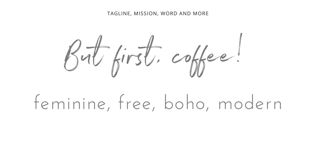
4 / Tagline, Messaging, or Key Words
It can also be useful to include any key words or phrases that you use throughout your brand touch points. Visuals are always the go-to for style guides, but messaging can also help to further define the overall tone of your brand. If you have something that you've been using, you can definitely include it in your guide to further define your brand.
Pro Tip: Do a word search to find words that resonate with you and your brand and include 3-5 that convey how you would like to be perceived by your audience. This will allow you to "check in" with those words/feelings when you are creating new content, adding to your brand, etc, and will help you to stay consistent in a more cohesive way than with just image and visuals.
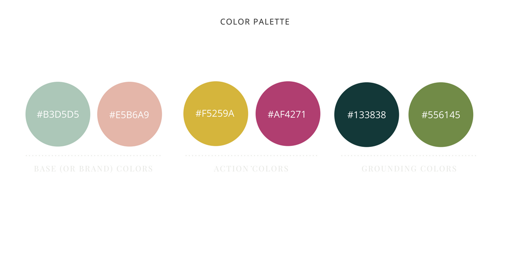
5 / Color Palette
Your logo will more than likely have a color or two included in it, so you'll definitely want to include those in the color portion of your style guide. Our suggestion is to also include a few other colors that go well with your base or brand colors that provide some pop for eye-catching callouts and colors that can help ground your designs.
Pro Tip: Experiment with your color palette to find the right fit for you. Do your research and be sure to check out our post on the topic: Color Your Brand with Confidence - 4 Steps to Building the Perfect Palette, where we talk about different ways to search for and select colors to best work for your brand.
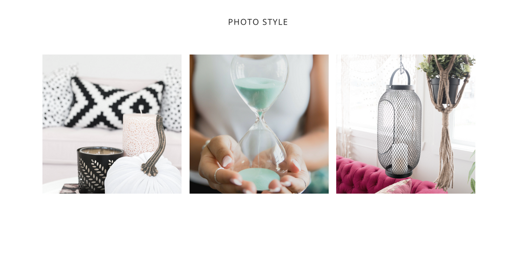
6 / Photo Styles
Imagery is a big part of your brand style guide. If you don't use images that resonate with your brand, you could end up with a really confused audience. Do your research to find images that fit well with the overall aesthetic you're aiming for, check in with your selected words, tag line, mission statement, etc. Styled stock is a great resource when it comes to finding images to fit within your palette of colors and typefaces. Find images that have the same overall look, feel, and tone, and don't be afraid to use color overlays and gradients to make the images more your own. Need help finding the right photos for your needs? See our post: How to Choose Styled Stock Photos For Your Brand
Pro Tip: If you're just starting out and don't have a logo, color palette or typefaces yet, don't stress! You can start here and move your way backwards through this guide to get you started. Find images that resonate with you, start to pick colors from their palette, and go from there!
And if you want to take your styled stock further, don't be afraid to experiment! Check out our tutorial to help you get creative with your photo choices: Video Tutorial: How to Customize Stock Photos Using Filters, Gradients and Overlays
Putting it All Together
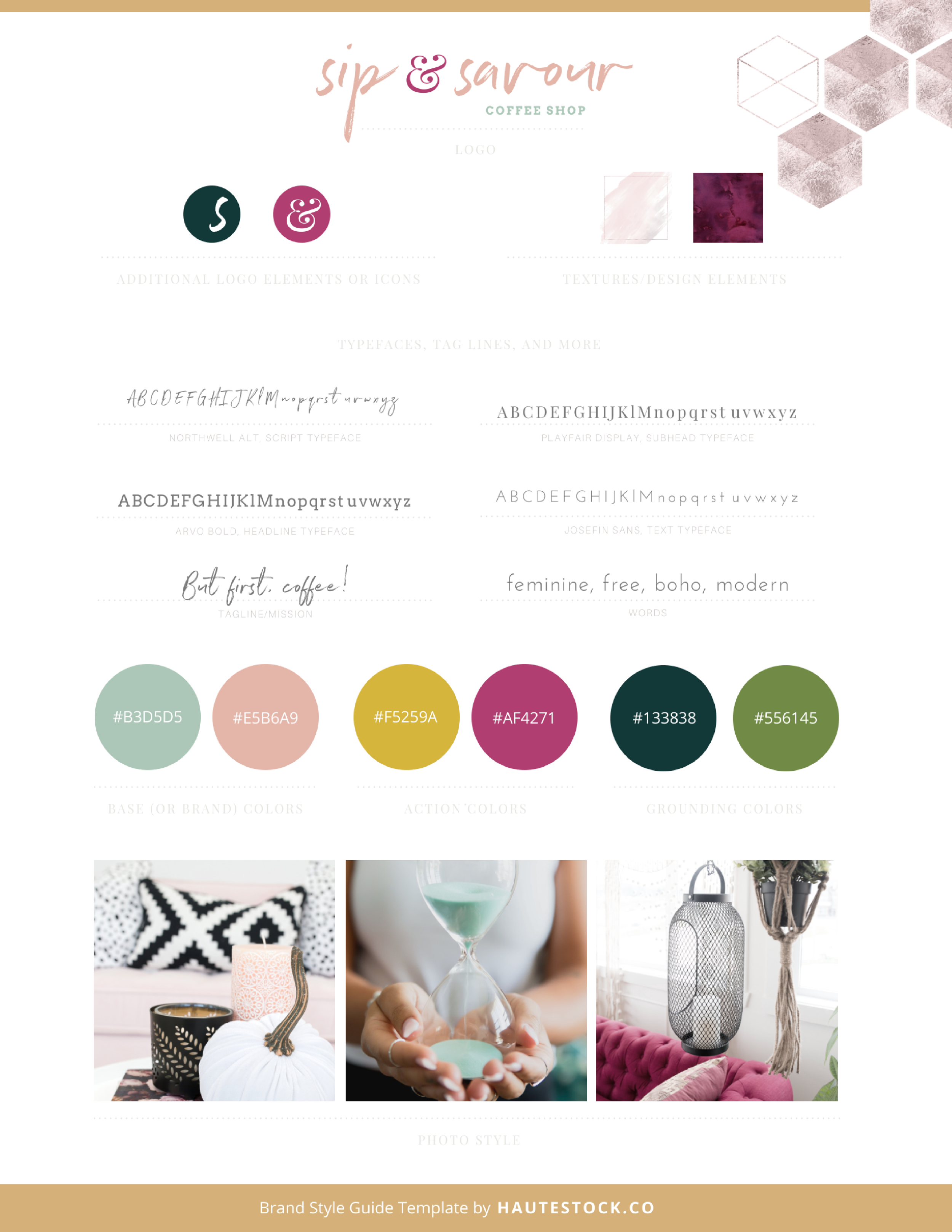
Once you have all the elements from above, you can pull everything together into your very own Brand Style Guide. It's a great way to organize all of your elements and to use as a reference point for you and any other contractors or service providers that may work with you and your brand. Don't forget, you can always tweak your Brand Style Guide and refine it as your brand grows.
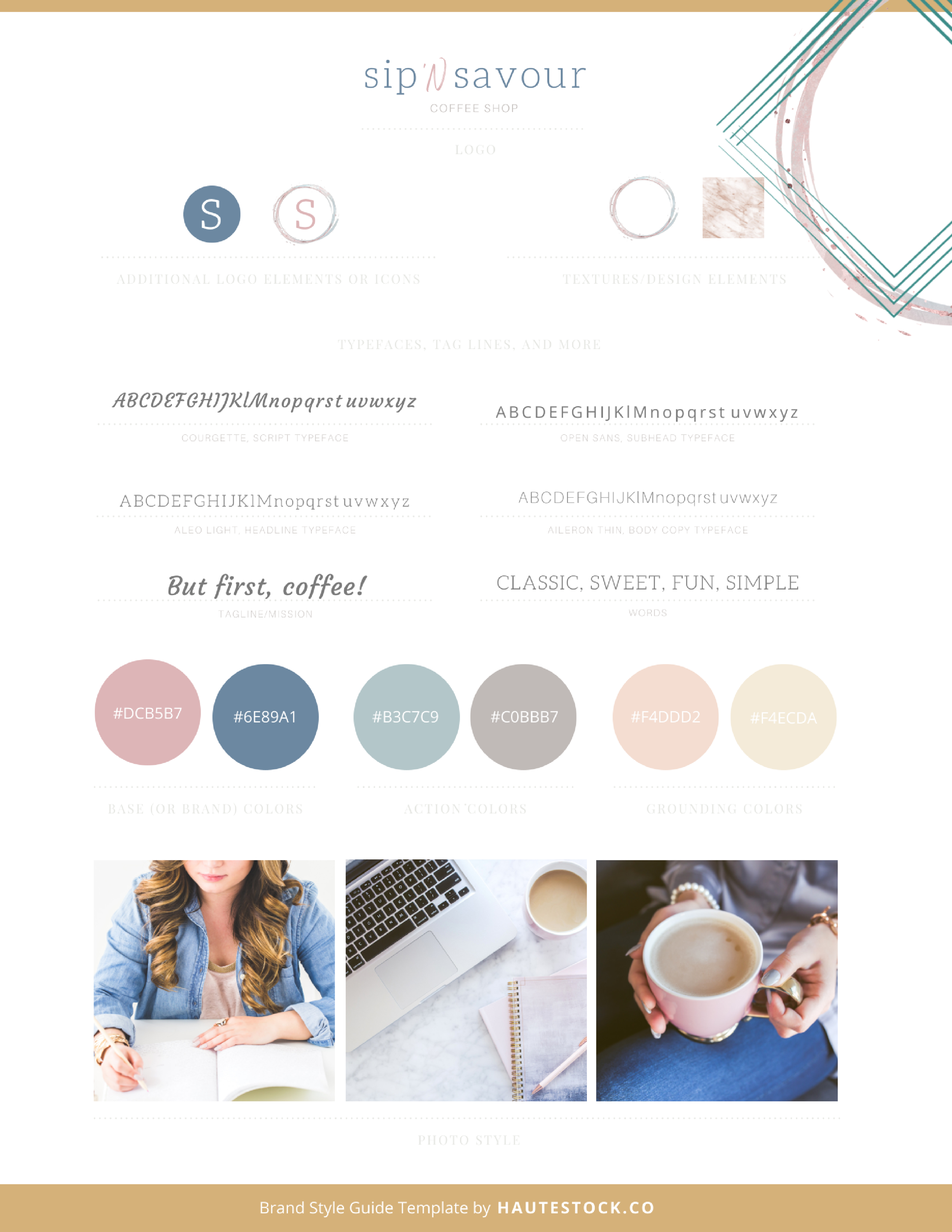
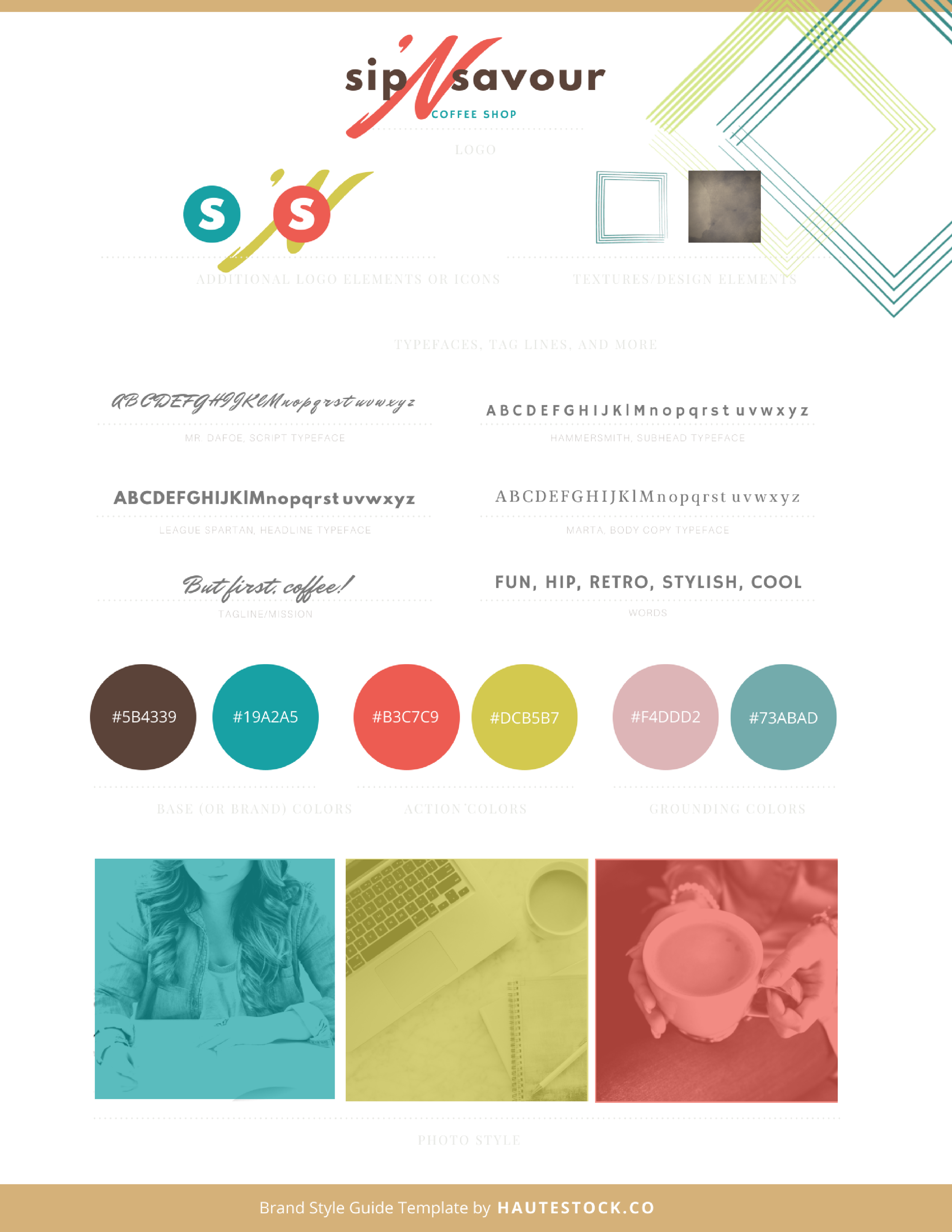
Check out these three brand style guide examples we created using all the SAME name and tag lines for our made-up coffee shop.
The last two brand style guides even use the same stock photos, but each one has a very different look and feel because of the colors, typefaces, image treatments, and design elements used to make each one of these brands unique.
Just a little inspiration of all the possibilities available to you as you start to build your own palette!
To get you started on creating your own Brand Style Guide, we have a FREE Blank Template for you to download and use!
So there you have it — the must-haves for creating a brand style guide that will help you create unique and cohesive visuals. As always, we would love to see what you come up with after you go through this tutorial. Be sure to share your creations with us!
Until next time, keep on styling!
The Haute Stock Team
Ready to rock your brand’s visuals?
sign up for hautemail and get 21 free stock photos!
This post was written by LeAnna Weller Smith: Executive Creative Director, Weller Smith Design & Design Expert, Haute Stock.

